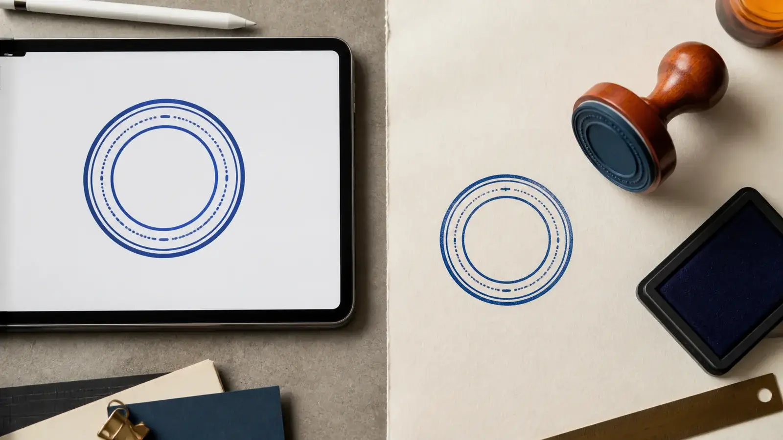
A small business owner approves one circular stamp design on a laptop. The accounts team wants to place it on an invoice PDF, while a packaging supplier asks for a mark that can be pressed onto paper tags. The artwork may look the same in both places, but the tools, outputs, and working habits are not the same.
Start with the object each method leaves behind. An online maker creates artwork that can be placed in a digital layout. A physical rubber stamp transfers ink to a surface. One is a file-based design tool; the other is a marking tool. Neither is automatically the better choice, and neither automatically carries legal authority.
Separating appearance from function makes it easier to choose a method, prepare the files, and avoid treating a stamp image as something it is not.
A digital stamp maker produces visual artwork. Depending on the tool and export option, the result may be a raster image such as PNG or a vector file such as SVG. PNG stores an image as pixels and can support transparency. SVG describes graphic shapes, text, and other elements in a form that can scale without relying on a fixed pixel grid. The receiving application still determines which formats it accepts and how it renders them.
The exported file can be inserted into a document, design, slide, web page, or print layout. It remains a file before it becomes part of a finished document. That distinction matters because the file may still be copied, resized, misplaced, or replaced unless the team controls how it is stored and used.
A physical stamp produces an impression on a surface. Its die, handle, and ink system become part of the result. Paper texture, ink condition, pressure, and alignment can change how the impression looks. Those variations can give an inked mark a tactile character, but they can also make very small text or thin lines harder to reproduce consistently.
If you are planning artwork that may later become an inked tool, a is a practical way to think about the circular border, center content, and limited detail before sending a design to a manufacturer.
| Question | Digital stamp artwork | Physical rubber stamp |
|---|---|---|
| What is the output? | An image or graphic file | An inked impression on a surface |
| Where is it used? | Digital documents and design software | Paper, card, labels, and compatible physical materials |
| When can placement change? | Before the document is finalized | Before the stamp is pressed |
| How consistent is the mark? | The source file can remain identical; rendering depends on size and software | Each impression can vary with ink, pressure, surface, and alignment |
| What must be stored? | Approved files, exports, and version notes | The stamp body, ink supply, samples, and replacement details |
| How is access controlled? | File permissions and approved-document workflows | Physical custody and storage procedures |
| What creates authority? | The surrounding process and applicable rules, not the picture alone | The surrounding process and applicable rules, not the impression alone |
The table compares media, not legal status. A familiar red circle on a PDF and a crisp ink impression on paper may both look official. Appearance alone does not prove who applied the mark, whether the document changed later, or whether a recipient will accept it.
Digital stamp artwork makes sense when the work begins and ends in software. Consider a brand team preparing a packaging proof for review. The designer can place the stamp artwork in the layout, check its size, and adjust the surrounding space before exporting the proof. No paper document needs to travel between desks.
The same logic applies to internal draft labels, presentation graphics, digital stationery, and status marks placed during a controlled document-editing process. The important advantage is not that digital is universally faster. It is that the stamp exists in the same environment as the work being prepared.
Digital placement also makes preflight easier. A user can zoom in, check whether the outer text is readable, confirm that the transparent background behaves as expected, and correct a placement before producing the final file. If the mark must appear at several sizes, a well-prepared master gives the team a reliable starting point for each export.
That convenience creates a management task. Teams need to know which file is current, who may use it, and which applications preserve its appearance. A folder full of names such as stamp-final, stamp-final-2, and stamp-new-final is not a dependable system. The artwork should have one approved master, clearly named daily-use exports, and a short record of changes.
A physical stamp fits work that is already physical. A receiving desk may need to mark paper packing slips as they arrive. A shop may add a small brand mark to paper bags. A studio may want the slight variation of ink on textured card because it suits the material better than a perfectly uniform printed image.
In these cases, the operator can mark the item without first scanning it or opening software. The tool is present at the point of work. That practical fit can matter more than abstract claims about one method being modern and the other old-fashioned.
Physical stamps also provide a direct real-size test. The team can press the stamp onto the actual stock and inspect the result under normal working conditions. This reveals whether a border fills in, fine text breaks apart, or an absorbent paper softens the detail. A design that looks clean at high zoom on a screen may need simpler lettering or more open spacing before it performs well in ink.
The tradeoff is that the impression cannot be repositioned after the press. Staff must align it before making contact, maintain the ink system, and know what to do with a poor impression. If the wording changes, the physical tool may also need to be remade rather than simply re-exported.
The strongest cross-media stamp designs are usually simpler than the screen preview suggests. Fine outlines, tiny reversed letters, tight spacing, and delicate distress textures can survive in a large digital preview but lose clarity when the artwork is reduced or transferred through ink.
Start by testing the smallest intended use. If the digital version will appear on a narrow invoice column, view it at that size rather than judging only from a large editor canvas. If the physical version will be pressed on uncoated paper, print a real-size proof and ask the manufacturer for production guidance. Screen magnification can hide a weak hierarchy.
Color needs separate treatment too. A digital file may use a specific screen or brand color, while a physical impression is constrained by the available ink and the color of the surface. Matching them exactly may not be possible or necessary. The more useful goal is a recognizable structure: the same wording, border proportions, center symbol, and visual weight.
Texture is another deliberate choice. Artificial wear can make a digital design look like ink, but it does not make the file a physical impression. Meanwhile, natural ink variation can be attractive on packaging and distracting on a small administrative mark. Choose texture because it supports the use, not because a stamp is expected to look old.
With a digital file, consistency begins at the source. If everyone uses the same approved export at the same intended size, the underlying artwork is repeatable. Yet the final appearance can still change when a user stretches the image, applies compression, places it over a colored background, or exports through software with different settings.
With a physical stamp, consistency depends on both the tool and the motion. The die may be unchanged, but the amount of ink and pressure can vary from one impression to the next. A simple technique, a suitable ink pad, and a flat working surface help, but some variation belongs to the process.
This difference affects quality control. Digital teams should inspect files, dimensions, contrast, and export settings. Physical teams should inspect the tool, ink coverage, working surface, and a real impression. Both benefit from a reference sample that shows what acceptable output looks like.
For digital assets that move between colleagues or suppliers, the explains how to separate an editable master, everyday exports, proofs, and version notes.
The word “digital” can create a dangerous shortcut. A visual stamp placed on a document is not automatically a cryptographic digital signature. Under the NIST Digital Signature Standard, digital signatures use algorithms to help detect unauthorized data changes and authenticate a signatory. A standalone PNG or SVG image does not provide those mechanisms by itself.
This does not make visual stamps useless. They can communicate a workflow state, brand a document, or reproduce an approved visual mark. Their value should simply be described accurately. If a process needs identity verification, tamper evidence, certificate-based signing, or a formal electronic-signature method, the organization needs a tool and policy designed for that purpose.
A physical impression has limits as well. Possessing a stamp does not by itself settle who used it or whether a document meets a particular filing rule. Acceptance depends on the document, recipient, organization, and jurisdiction. For contracts, certificates, government forms, notarial work, medical records, or financial instructions, check the receiving party's current requirements and obtain appropriate local advice.
If you need both digital and physical versions, create one controlled design system rather than two unrelated marks.
- Lock the wording first. Confirm the name, message, capitalization, and date format before polishing the shape.
- Use a clear master. Keep an editable, scalable source when available, plus a proof that shows the approved appearance.
- Set separate output sizes. Define the digital placement size and the physical impression size. Do not assume one export suits every destination.
- Simplify for the physical version. Open tight spacing and remove details that are unlikely to hold in ink. Keep those changes documented.
- Test on the real destination. Place the digital version in a copy of the actual layout and test the physical version on the actual stock.
- Name the variants clearly. Labels such as
digital-transparent,print-proof, andphysical-production-artare more useful than a sequence of “final” files. - Assign an owner. Someone should approve changes and retire old files or obsolete physical tools.
The two outputs do not have to be mechanically identical to feel like the same stamp. Small production adjustments are reasonable when they preserve the identity and improve legibility.
When the starting point is an existing ink impression rather than editable artwork, use the to capture, clean, and test it before treating the result as a reusable asset.
The first mistake is comparing only appearance. Two marks can look alike while serving completely different workflows. Ask what the output must do after it is created.
The second is assuming digital artwork is maintenance-free. It has no ink pad, but it still needs file organization, access rules, backups, and version control.
The third is designing only at a large screen size. Stamp artwork should be judged at its real placement or impression size.
The fourth is treating a physical stamp as inherently more official, or a digital one as inherently more secure. Authority and security come from the full process, applicable requirements, and control mechanisms.
The fifth is forcing a single answer across every task. A company can use digital artwork for document preparation and a physical tool at a receiving desk without contradiction. The media can share a design while solving different problems.
You can explore more layout and workflow examples in the , but keep the final choice tied to your own destination and control needs.
Is a digital stamp just a picture?
At the file level, a visual digital stamp is graphic artwork. It can still play a useful role in a documented workflow, but the picture alone does not establish identity, consent, document integrity, or legal acceptance.
Can an online stamp maker create artwork for a rubber stamp?
It can create a useful starting design if the export has enough quality and the layout suits physical production. Ask the stamp manufacturer to confirm file format, minimum detail, dimensions, and any production adjustments before ordering.
Which format is better for digital stamp artwork?
It depends on the receiving software. SVG is useful as a scalable vector-based master when supported. PNG is widely used for raster artwork and can preserve transparency. Keep the best editable master you have and export a tested daily-use version for the actual document workflow.
Does a physical stamp look more authentic?
It looks physically inked because it is. That material character may suit packaging, stationery, or paper processes. It does not automatically give the mark greater authority or prove who applied it.
Do I have to choose only one method?
No. Many workflows are naturally mixed. Use shared wording and proportions, then prepare separate digital and physical outputs with their own tests and controls.
The central difference is straightforward: a digital stamp maker creates artwork, while a physical stamp creates an inked impression. From that difference follow the practical questions about placement, storage, consistency, revision, access, and testing.
Choose digital artwork when the job belongs inside a digital document or design workflow. Choose a physical stamp when the work happens on a real surface at a real desk, counter, or packing station. Use both when the same identity must travel across both environments.
Most importantly, keep appearance separate from proof. A professional-looking mark can clarify a process or support a brand, but it is not automatically a signature, security control, or legal authorization. Build those requirements into the workflow around the stamp.
