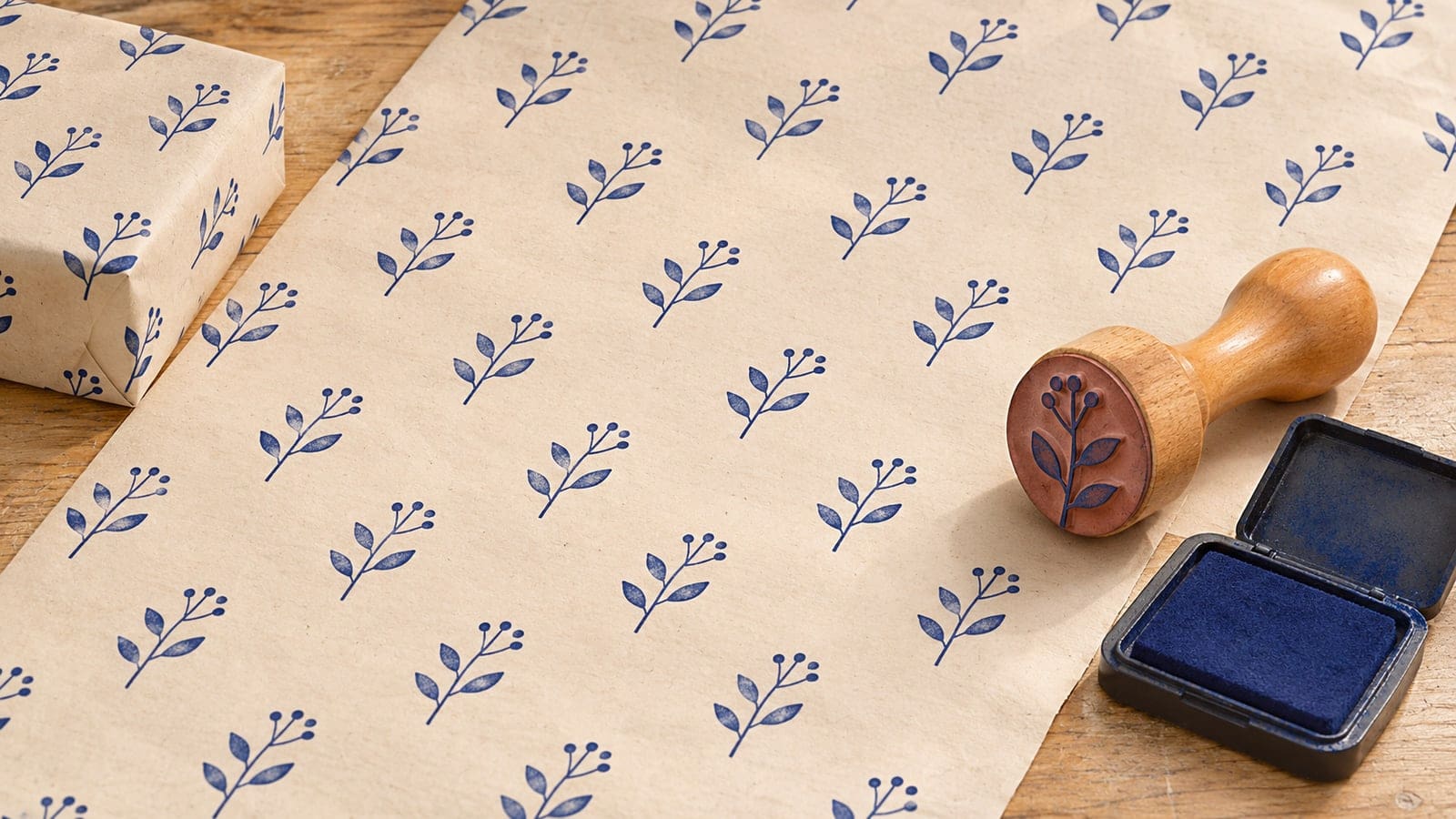
A single leaf stamp looks pleasing on a gift tag. Repeated across a full wrapping sheet, the same leaf can look crowded in one corner and oddly sparse in another. Making the sheet work involves deciding where each impression goes, how much paper shows between them, and what happens when the sheet folds around a box.
Start with one motif, one ink color, and a scrap of the paper you want to use. Draw a few possible arrangements on a separate sheet, make a short stamped trial, and wrap a small object with it. You can then choose the spacing before committing to a full sheet.
This tutorial covers the design and placement of a hand-stamped repeat. You can draw the motif in an online stamp maker and have a supplier make the physical stamp. The examples below use simple leaves, dots, and geometric shapes that you can replace with your own artwork.
Lay out several paper copies of your design before changing its detail. A mark with a clear silhouette is easy to recognize across a sheet. A simple branch, a small geometric flower, or a compact symbol can give you plenty to work with. Choose artwork you created or have permission to use.
Look at the shape of the paper around each copy. A long horizontal twig leaves a different gap from a round flower. An asymmetric leaf can lean toward its neighbor, making the empty area seem smaller on one side. Rotate the paper copies to see how those spaces change.
Remove a detail if it makes the trial feel busy. Tiny veins, closely packed dots, and narrow gaps may disappear when the physical stamp prints on your chosen paper. Ask the supplier to assess the final artwork at the size you intend to order. Keep a simpler version in the design file so you can compare both proofs.
If you need an editable starting point, browse the . Choose a layout that lets you isolate the motif. A border or sample wording that suits a document stamp may use space you want to leave open in a decorative repeat.
Cut out several copies of the motif and move them around. Use the same number of copies for each arrangement so you can compare the gaps fairly. You can photograph the trials from above to remember which one you preferred.
Straight rows
Put each impression directly below the one above it. This makes the columns easy to follow and gives you a straightforward way to place the next stamp. Try it with a motif that has a clear top and bottom. Check whether the open space forms strong vertical channels between columns.
Offset rows
Move every second row sideways by half of the distance between neighboring centers. This spreads the impressions across the gaps in the row above. A small leaf or flower can work well in this arrangement because you can follow diagonal paths across the sheet as well as horizontal ones.
A loose scatter
Place the motifs in varied positions while watching the size of the empty areas. Give yourself a rule, such as keeping the largest gaps roughly similar, so each new impression has a reason to be there. Try this arrangement on a small piece first. It gives you fewer fixed reference points when you move to a full sheet.
Choose the arrangement that you can comfortably repeat at the table. A straight grid is a useful first exercise. An offset arrangement adds another placement decision. A scatter gives you room to adjust by eye as the sheet develops.
Measure the motif's widest part and make a trial with a gap that looks generous beside it. For a hypothetical 20 mm wide motif, you could try centers 40 mm apart. That leaves approximately 20 mm between the widest edges of neighboring impressions when those edges line up. The numbers are a sketching example. Your motif may need a different gap.
Draw a second trial with more space and a third with less. Compare them from the distance at which someone will hold a wrapped gift. Dense arrangements show more of the motif. Wider spacing gives the paper color a larger role. Consider where a ribbon or tag will sit as you compare them.
For offset rows, mark the centers before drawing the shapes. If centers are 40 mm apart along a row, start the next row 20 mm farther across. Choose the distance between rows separately. A tall leaf may need more room vertically than a compact round mark, even when the horizontal spacing is identical.
Keep one approved arrangement as your reference. A small note of the center spacing can help you reproduce it later, but save the paper proof too. The visible balance between shapes can be easier to understand from that proof than from dimensions alone.
You can use a strip of scrap card as a spacing ruler. Mark where the centers of consecutive impressions should land and place it beside the row you are working on. Move it as you advance. Test the guide with pencil marks on waste paper before opening the ink pad.
Give the guide a way to line up with an edge or a reference mark. If it floats freely, each small movement can change the angle of a row. Use light pencil references in an area you can trim away. Keep the guide outside the part of the sheet that has already been printed.
Look at your physical stamp from above. The handle or mount may extend beyond the printing face. Learn where the center of the impression sits relative to the part you can see. A small orientation mark on the handle can help you repeat the direction of a leaf or branch.
For a large sheet, work on a clean, flat support with room for the paper to rest. You may prefer to cut a manageable sheet from the roll before stamping. Move ink pads and spare tools out of the route your hands will take across the sheet.
Use the same paper and ink you plan to use for wrapping. Check the ink supplier's information for that surface, especially if the paper is coated. Make an impression, let it dry as directed, and check whether it transfers when another scrap touches it. Choose the drying and handling routine from the actual trial.
Print a short first row, then a second and third. Follow your guide without trying to repair every small variation immediately. At the end, look across the rows and compare the gaps. If an arrangement already feels awkward in a small trial, adjust it while the cost is a few scraps of paper.
Watch how you press and lift the stamp. Use a steady motion and check that the working surface is flat. If the impression rocks or smears, practise that motion on a spare strip. A clean print of the motif helps you judge the spacing without a printing problem distracting you.
When the trial is dry, fold it around a small box or a piece of card. Look at the front face and the corners. You may find that a pleasing flat arrangement puts a large blank area across the top of the wrapped object. Move the sheet slightly or try another spacing before making the final piece.
Choose a starting edge and follow the same order along each row. Keep track of the offset on alternate rows if you are using that arrangement. You can write the starting positions on the scrap guide. Leave room to move your hand without resting it on a fresh impression.
Pause after a few rows and look from the far end of the table. The gap between rows should tell the same visual story as the gap between neighboring motifs. If a line is beginning to drift, use your references to place the next row. Small handmade variations can sit comfortably within a clear overall arrangement.
At the edge of the sheet, a partial impression can make the pattern feel as though it continues beyond the paper. Put waste paper underneath the edge to catch the part of the impression that falls outside. Try that finish on the sample strip so you know how much of the motif you want to show.
Leave the finished sheet flat until it can be handled according to the ink instructions and your trial. Roll it loosely or keep it flat for storage once dry. Make one complete wrapped example before preparing several sheets for a set of gifts or small orders.
If rows seem to slope, check the guide against the edge you started from. A paper edge cut at an angle can give a misleading reference. Draw a fresh straight reference on the waste margin and compare the next trial with it.
If the sheet looks dense, increase the spacing before reducing the motif. A smaller motif can lose detail while leaving the same crowded rhythm. If the density is mainly inside the design, simplify that artwork and compare a new proof.
If impressions look uneven, inspect the support, paper, and inking routine on a spare piece. Change one part of the process at a time. The discusses testing different packaging surfaces and preparing artwork for a supplier.
For an occasional misplaced impression, wrap a practice object with that section before deciding what to do. The fold may put it on the underside, or you may prefer to cut that piece into a tag. Keep a finished reference sheet if you want the same spacing on a later batch.
Can I use two colors in the pattern?
Yes. Begin with two separate impressions that have generous space between them. Test the order and handling on a scrap, following the ink instructions. A design that requires precise alignment between colors adds a placement task at every repeat.
Should I stamp before or after wrapping the gift?
Stamping a flat sheet lets you use a steady support and see the whole arrangement. After it dries, wrap the gift and adjust the paper's position to choose the front face. Try that sequence on one object before making a set.
Can I use a logo as the repeated motif?
You can use a logo you are authorized to reproduce. Print several copies of its stamp version and judge them together. A long tagline may be hard to read when repeated around folds, so try the main symbol on its own as well.
How do I keep a pattern consistent across different paper sizes?
Keep the motif and spacing the same, and allow the edges to crop at different points. Save the guide with a marked starting position. For a much smaller object, make a separate wrapping trial to see how many impressions will appear on its main face.
Arrange paper copies of one motif, choose a gap, and stamp a short trial on your actual wrapping stock. Fold that trial around an object before making the full sheet. Once the repeat works, keep the guide and a dry proof together for the next batch. Find more ways to adapt the artwork in the .
