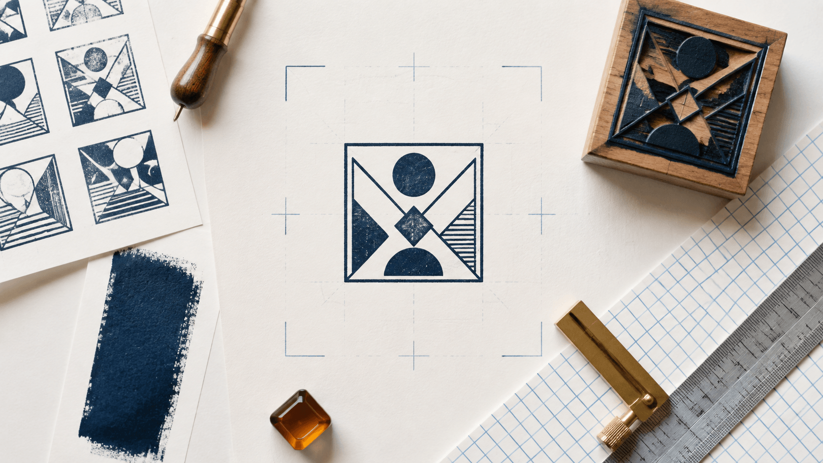
A designer places a short company name inside a square border. The words fit, the border is centered, and the icon sits on the middle guide. Yet the mark still feels unfinished. The four corners look empty, the name forms a wide horizontal band, and a tiny second line floats below it without connecting to the shape.
Square stamp design creates a particular layout problem: the frame promises equal weight in two directions, while most words naturally spread from left to right. Filling the corners with decoration rarely fixes that mismatch. The better approach is to choose a clear content structure, build spacing from the inside out, and let the border support the hierarchy.
The focus here is square geometry, not whether a square is universally better than another shape. You will learn how to map the content, handle corners, balance borders, place text and symbols, and prepare versions that remain useful at their actual size.
List the elements before drawing the square. A compact mark usually needs no more than three roles:
- a primary identity or status;
- a secondary descriptor, place, or date;
- an optional center symbol or monogram.
Assign each item a job. If two lines both act like a headline, the square will feel crowded even when the software reports plenty of empty area. If the icon and name both demand the center, one should become secondary.
Sketch the information as simple rectangles. A wide name becomes one horizontal block. A monogram becomes a compact central block. A short location becomes a quieter footer. Move those blocks around before choosing a typeface. This makes the structural conflict visible without the distraction of styling.
A provides a useful neutral frame for testing these arrangements. Replace the sample content with the exact approved words because a seven-letter name and a twenty-letter name create different designs.
Corners are not automatically wasted space. They make the frame feel stable and distinguish a square from a wide rectangle. Problems begin when the center is treated as a rectangle while the corners are treated as holes that must be filled.
Use the corners in one of four deliberate ways:
Leave them quiet
Open corners can frame a strong center. This is often the cleanest solution for a monogram, short status, or compact icon. Empty space gives the main element room to read.
Extend a border system into them
A double border, clipped corner, or inset line can activate the corners without adding symbols. Keep the gap consistent and inspect the result at small size. Closely spaced lines may merge after reduction or physical reproduction.
Use one repeated accent
Four small dots or short corner ticks can create rhythm. They should remain subordinate to the identity. If the accents are the first thing you notice, reduce their weight or remove them.
Build a diagonal relationship
Two opposite corners can hold small matching elements, such as a year and location code. This creates movement but also increases reading complexity. Use it only when the information is genuinely useful and short.
Avoid placing a different ornament in every corner. Four unrelated icons turn a compact stamp into a collection of tiny illustrations. Repetition and restraint make the square feel intentional.
The border should define the footprint without overpowering the words. Judge it beside the heaviest letter stroke, not in isolation.
A thin border can look elegant in a large preview and disappear at normal use size. A very thick border can trap the content, reduce the usable center, and become the darkest element. Begin with a moderate single line. Test alternatives only after the content is in place.
An inset border creates a second spacing decision. The gap between lines must be wide enough to remain visible, and the inner line must leave room for the content. When the design is small, one strong line often reproduces more cleanly than two fragile lines.
Rounded corners soften the mark and can help it sit beside friendly brand graphics. Sharp corners feel more mechanical and structured. Clipped corners create a technical shape but should not be added merely to occupy space. Choose a corner style that matches the purpose and apply the same radius or cut consistently.
For physical production, line behavior depends on the manufacturing method, size, ink, pressure, and surface. Treat screen measurements as a starting point and confirm practical limits with the supplier. A real-size proof is more useful than an enlarged screenshot.
Square stamps usually work best with one of a few stable reading patterns. Pick a pattern that matches the wording rather than forcing every phrase into the same centered stack.
Centered identity with a quiet footer
Place the name or short status in the optical center and put the descriptor below at a smaller size. The footer should be wide enough to feel connected but light enough to remain secondary. This pattern suits a short business name, department, or internal state.
Monogram over a full name
A compact monogram uses the square's vertical space well. Put the letters or symbol in the upper center, then place the full name as a stable line below. Leave more space between the border and monogram than between the two text levels so the content reads as one unit.
Top and bottom bands
Use a primary line near the top and a secondary line near the bottom, with a simple symbol in the center. This distributes weight vertically. Keep the center simple; a detailed logo squeezed between two bands will lose clarity.
Vertical side text
Side text can look distinctive, but it asks the reader to rotate the mark mentally. Reserve it for short supporting words, not the primary identity. If both sides contain text, establish one reading direction and test whether the result still makes sense when placed beside normal horizontal copy.
Do not stretch letters wider simply to touch the sides. Adjust the composition, tracking, or approved wording first. Distorted typography may fill the square while weakening recognition.
A mathematically centered object can look displaced. A letter A carries weight differently from an M. A leaf icon may be dense at its base. A two-line name may appear low because the second line is darker.
Start with alignment tools, then inspect the complete mark at actual size. Make a copy and move the central group a small distance up, down, left, or right. Compare the versions without guides. The correction should be subtle; large offsets usually indicate a deeper hierarchy problem.
Turn the design upside down for a moment. You do not need to read it that way. The rotation helps reveal uneven dark areas and border gaps. A mirrored copy can expose horizontal drift for the same reason.
Also view the mark as a small silhouette. If the upper half forms one heavy block and the lower half disappears, change size or spacing before adding ornaments. Balance comes from the relationship among masses, not from filling every coordinate.
An icon can anchor the square, but it should have a clear reason to exist. A simple brand symbol, product category cue, or short monogram can work. Generic crowns, shields, laurels, and stars may make the mark look official without adding useful meaning.
Simplify the chosen symbol. Remove fine outlines, tiny gaps, gradients, shadows, and multiple colors when the stamp must work at small size or in ink. Compare a solid version with an outline version. The solid silhouette often survives reduction better, while the outline may feel lighter in a digital layout.
Protect space around the icon. Do not enlarge it until it nearly touches the border or text. The surrounding gap helps the eye separate the symbol from the frame.
If the mark already contains a strong monogram, a second icon is probably unnecessary. One focal element is easier to recognize and maintain across sizes.
Instead of designing dozens of random variations, start with three controlled constructions.
Recipe 1: Compact status
Use one bold word in the center, a small date or initials field below, and a single square border. Leave all four corners open. This arrangement supports operational marks where speed matters more than decoration.
Recipe 2: Small brand identity
Place a simplified symbol above the business name and a short descriptor below. Use slightly rounded corners and generous side margins. Keep the descriptor optional for the smallest version.
Recipe 3: Monogram seal
Set a two-letter monogram in the center, place the full name in a narrow lower band, and use four subtle corner ticks. Use one border unless a larger size clearly supports an inset line.
Keep the same wording while comparing the recipes. If every version changes the typeface, symbol, border, and color, you will not know which structural decision improved the result.
The broader can help when the square itself is still undecided. Once you commit to a square, judge the design by how well it uses equal width and height, not by how closely it imitates a circular seal.
Large editor previews hide weak spacing. Export a clean draft and place it in the smallest real destination: a document corner, product tag, card, internal form, or print proof.
Check these failure points:
- the border disappears or fills in;
- secondary text becomes a gray line;
- corner accents merge with the frame;
- the symbol loses important openings;
- the central group appears too low or too wide;
- the square looks like a rectangle because margins are uneven.
Test in monochrome even if the final design uses color. Print and scan a sample when that path matters. If a physical tool is planned, ask the supplier to review the actual-size artwork and test the intended surface.
Create a simpler companion version when necessary. Removing a descriptor or corner accent at small size is better than shrinking every element until nothing reads.
Before approving the design, confirm that:
- every element has a primary, secondary, or supporting role;
- the corners are intentionally open, repeated, or structured;
- border weight supports rather than dominates the content;
- the primary line is readable without stretching letters;
- the center is optically balanced after the guides are hidden;
- icon detail survives the smallest intended output;
- internal margins are consistent on all four sides;
- monochrome and grayscale versions preserve the hierarchy;
- the real-size proof has been reviewed in context;
- the editable master and approved exports are clearly named.
The provide additional construction and workflow examples. Use them to support the process, while keeping this square design focused on one content map and one real destination.
What content works best in a square stamp?
A short identity, compact status, monogram, or simple symbol works well. Give the mark one primary message and limit secondary text so the square does not become a miniature poster.
Should a square stamp have rounded corners?
Either rounded or sharp corners can work. Rounded corners feel softer; sharp corners feel more structured. Choose one style that suits the purpose and keep the radius or cut consistent.
How do I fill empty corners?
You may not need to. Open corners can strengthen a clear center. If an accent helps, repeat one small shape or extend the border system instead of adding four unrelated decorations.
Is a double border more professional?
Not automatically. A second line can organize a large design, but it also consumes space and may merge at small sizes. Use it only when the real-size proof remains clear.
Can the same square artwork become a physical stamp?
Often it can provide a production starting point, but manufacturing requirements vary. Simplify fine detail, proof at actual size, and ask the supplier to confirm the file, dimensions, and line behavior.
A balanced square stamp does not need a decoration in every corner. Map the content first, choose one reading pattern, build the border around the hierarchy, and make small optical corrections after mathematical alignment.
The best version uses the square's equal dimensions to create a compact, stable mark. When the primary message remains clear at real size and the empty areas feel intentional, the geometry is doing useful work.
