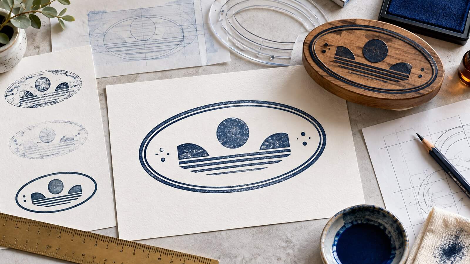
A small studio wants a compact stamp for packaging cards. Its name is too long for a comfortable circle, yet a wide rectangle feels like an office label. An oval seems ideal until the designer bends every word around the border. The center becomes empty, the narrow ends become crowded, and the smallest letters disappear in the first real-size print.
An oval stamp can hold a long horizontal identity while keeping a softer, badge-like silhouette. Its advantage comes from proportion, not from filling the perimeter. The design works when the long axis supports the main name and the tapered ends are treated as breathing room.
This guide covers oval proportions, straight and curved text, end spacing, borders, symbols, and real-size testing. It treats the oval as a design frame, not as a sign of official status or authority.
An oval is neither a stretched circle nor a rectangle with rounded corners. Its curvature changes continuously. The top and bottom offer long, shallow arcs, while the left and right ends tighten quickly.
That geometry creates two useful zones:
- a broad central band for a name, phrase, or symbol;
- quieter end zones that protect the central content from the border.
Design problems begin when the ends are treated as spare containers. Small dates, stars, abbreviations, and decorative marks accumulate there because the center already feels occupied. At actual size, those additions collide visually with the tight curve.
Begin with the main reading path. If the name is the priority, place it horizontally across the center and let the oval frame support it. If a symbol is the priority, center the symbol and use short curved wording above and below. Do not force both structures into one small mark.
The right width-to-height ratio depends on the length and shape of the content. A short name in a very wide oval will look stranded. A long name in a nearly circular oval will shrink until it is unreadable.
Build three quick frames around the approved content:
- a compact oval with a gentle horizontal stretch;
- a medium oval that gives the name visible side margins;
- a wide oval for long words or a symbol-plus-name arrangement.
Compare them at the intended physical or digital size. Choose the narrowest proportion that allows the main line to remain comfortably readable. Extra width is not automatically useful; it can weaken the connection between the content and frame.
Measure clear space from the actual letter shapes, not only from the text box. A capital M or wide terminal may approach the curve sooner than a narrow letter. Look at the optical gap on both ends and adjust placement by eye after centering mathematically.
The provide a practical starting point for testing the real wording in different shapes before committing to one proportion.
Straight text across the center is usually the clearest choice for a long name. It follows a familiar reading direction and uses the widest part of the oval. A small secondary line can sit below it without touching the lower curve.
Curved text works best when the phrase is short enough to follow the arc without aggressive compression. The upper arc may hold a short brand or department name; the lower arc may hold a location or concise descriptor. Long phrases become harder to space because letters rotate and the available width narrows toward each end.
Do not curve text merely to prove that the shape is oval. A clean horizontal line inside an oval can feel deliberate and distinctive. The frame already provides the shape language.
If both upper and lower arcs contain text, keep their visual weights related. A bold upper phrase and a tiny lower phrase can make the design tilt upward. Shorten the lower wording, enlarge it, or remove it rather than filling the gap with fragile detail.
The narrow ends are the defining constraint of oval stamp design. They need more empty space than a rectangular corner because the border approaches the content from several directions at once.
Establish an inner safe oval and keep important letters, symbols, and dividers inside it. Decorative elements may extend slightly beyond the safe zone only when they remain simple and do not compete with the main content.
Useful end treatments include:
- leaving both ends completely open;
- placing one small dot on each side;
- using a short horizontal divider that stops well before the curve;
- allowing a central symbol to create its own side margins.
Avoid clusters of stars, dates, initials, or ornamental flourishes. Symmetry does not require filling every gap. Empty ends make a long central name feel more stable and improve reproduction when the stamp is reduced.
The border tells the eye where the oval begins and ends. A single medium-weight line is the safest starting point. A double border can add structure, but the gap between rings must remain open after printing.
Very thin double lines often merge or disappear unevenly. A heavy outer ring plus heavy inner content can make the impression feel cramped. Adjust the border after the text hierarchy is working, not before.
The explains how single, double, open, and decorative frames affect clarity. For an oval, pay special attention to the ends: the inner and outer lines sit closest there, so inconsistent spacing becomes obvious.
An open border can work for a modern identity, especially when the name is long. Small breaks near the left and right sides may create breathing room, but they should look intentional and survive imperfect stamping. Test whether the openings remain visible when ink spreads slightly.
When a name does not fit, designers often reduce the entire composition. That preserves the layout on screen but sacrifices readability. Solve the content before reducing size.
Try these changes in order:
- remove a descriptor that appears elsewhere;
- place the descriptor on a separate secondary line;
- use a slightly narrower but still readable typeface;
- increase the oval width modestly;
- simplify or remove the central symbol;
- create a second approved version for smaller uses.
Do not distort letters horizontally. Artificial compression damages familiar letter proportions and can make the name look weak. Choose a typeface designed with narrower forms instead.
Track the main name carefully. Too little spacing creates a dark band; too much makes the phrase fragment. Capitals often need modest spacing, while mixed-case names may already have enough rhythm. Judge the complete word at actual size rather than applying one numerical value mechanically.
A symbol can sit above the name, below it, or to one side. Each arrangement changes the reading path.
A centered symbol above a straight name creates a clear vertical hierarchy, but it requires enough height. A symbol on the left can support a wide, shallow oval, provided the name still has room and the right side does not feel empty. A symbol behind or between parts of a name often interrupts reading.
Keep the symbol simpler than it appears on a website or large sign. Fine internal lines, small counters, and delicate outlines can close up in an impression. Use a reduced mark designed for small reproduction rather than shrinking a detailed logo unchanged.
If the oval will be used without a symbol, strengthen the typographic structure instead. A confident name, small descriptor, and well-spaced border can be more recognizable than a crowded emblem.
Straight text creates curved pockets above and below. Those spaces do not have to be equal in area, but they should feel intentional.
Move the main line slightly above mathematical center when a secondary line sits below. If the name contains many round lowercase letters, it may appear lower than a line of capitals even when both share the same baseline. Optical adjustment matters more than perfect coordinates.
A short divider can separate the name from a secondary line. Stop it before the oval begins to narrow. Long dividers that nearly touch the ends exaggerate small alignment errors.
When the design feels empty, resist adding decoration immediately. Print it first. At stamp size, the apparent empty space often becomes the margin that keeps the impression readable.
One oval layout may not serve every size. A packaging card can support a fuller design, while a small PDF corner or narrow label may require a simplified version.
Create controlled variants based on use:
- a primary oval with the full approved name and descriptor;
- a small version with the name only;
- a one-color production version with simplified symbol detail;
- a digital version checked against light and dark page areas.
Keep the same core proportions, type family, and border character so the versions feel related. Name the files by purpose and size instead of using final, new, or latest.
The broader can help compare creation methods, but each oval version still needs a proof at its actual destination size.
Zoomed artwork hides most oval-stamp problems. Print the design at 100 percent and look at it from normal reading distance. Then scan or photograph the proof and view it as a small thumbnail.
Check five things:
- the main name is readable before the border attracts attention;
- the left and right ends retain open space;
- curved text does not tighten abruptly near the sides;
- double borders remain separate;
- the smallest secondary line survives reproduction.
Test on the real surface when possible. Textured paper can break fine strokes. Absorbent stock can spread ink. Digital placement over a busy background can reduce contrast. The design should not depend on a perfect impression to remain understandable.
The first mistake is stretching a circular design horizontally. The border changes, but the internal spacing and curved text still behave as if they belong to a circle.
The second is filling the narrow ends with decoration. Those details make the busiest part of the geometry even tighter.
The third is shrinking a long name until it technically fits. Readability is a stronger constraint than symmetry.
The fourth is using too many curved lines: two border rings, two text arcs, several dividers, and a curved symbol. The repeated contours create noise.
The fifth is judging only on screen. Oval designs need real-size print, scan, and surface tests.
Is an oval better than a rectangle for a long name?
An oval can give a long name a softer, badge-like frame, while a rectangle offers more predictable corner space. Choose based on the intended tone, content, and placement.
Should the main name follow the oval curve?
Usually not when the name is long. Straight central text is easier to read and uses the widest part of the shape. Reserve curved text for shorter phrases.
How much space should be left at the ends?
There is no universal measurement. Leave enough optical space that no important letter or symbol feels pinched by the tightening curve, then verify at actual size.
Can an oval stamp use a double border?
Yes, if both lines and the gap between them remain distinct after printing or stamping. Test the narrow ends carefully because that is where crowding is most visible.
Does an oval shape make a stamp official?
No. Shape and styling affect appearance only. Authority, acceptance, and legal effect come from the applicable organization, process, and local requirements.
An effective oval stamp uses its long central band and respects its narrow ends. Start with the approved name, choose the least stretched proportion that fits it comfortably, and decide whether straight or curved text best supports the reading path.
Keep the border subordinate, simplify symbols, and treat empty end space as a functional part of the design. A real-size proof will reveal more than a polished screen preview. When the name remains readable and the oval still feels open, the shape is doing useful work rather than merely decorating the content.
