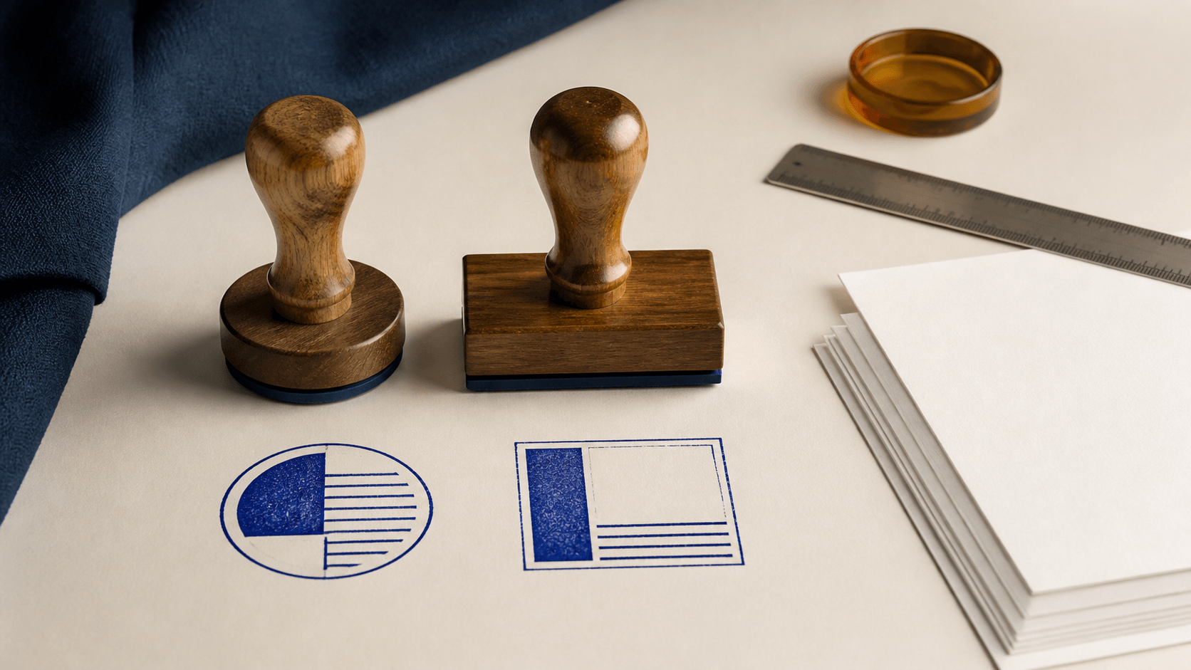
A small product brand needs one mark for thank-you cards and packing slips. The approved content includes a logo, a short brand name, a web address, and an optional date line. A round badge looks distinctive on the card, but the address becomes cramped around the edge. A rectangle holds every line comfortably, yet feels too much like an office label on the packaging.
This is not a choice between a creative shape and a practical one. Round and rectangular stamps organize information differently. A circle favors a central symbol and short perimeter text. A rectangle favors horizontal reading, aligned fields, and predictable placement beside other document content.
Choose the shape after you know the wording, destination, and smallest use. The right outline is the one that gives the important information enough room without forcing the reader to decode the design.
A stamp outline is not decoration added at the end. It creates the internal grid.
In a round stamp, the eye usually moves from the outer silhouette to curved text, then toward a center symbol or word. The design has a natural focal point, but the usable width changes from the middle to the top and bottom. Long straight lines fight that geometry.
In a rectangular stamp, the eye can move across horizontal lines or down a stack of labeled fields. The corners create stable alignment points. The shape uses narrow document spaces efficiently, although it can feel dense when every available row is filled.
The difference becomes obvious when the same copy is placed in both frames. A company name may sit comfortably on the upper arc of a circle, while a street address breaks awkwardly across the lower arc. In a rectangle, both can align cleanly, but a small central emblem may lose the prominence it had inside the circle.
Begin with the real copy. Placeholder words hide the constraints that determine the best shape.
| Decision factor | Round stamp | Rectangular stamp |
|---|---|---|
| Best content pattern | Short identity around a center | Straight lines, labels, and fields |
| Natural focal area | Center symbol or monogram | First line, left edge, or divided panel |
| Long wording | Often needs editing or abbreviation | Usually easier to arrange horizontally |
| Handwritten additions | Limited unless a field is planned carefully | Easy to reserve boxes or blank lines |
| Narrow page margin | Can waste width around curved sides | Fits a horizontal or vertical strip well |
| Badge-like brand use | Strong silhouette | More label-like and informational |
| Alignment with tables | May appear detached from row structure | Can follow columns and rules naturally |
| Small-size simplification | Remove arc text or inner rings | Remove rows, dividers, or secondary labels |
The table is a starting point, not a universal rule. A sparse rectangle can function as a brand device, and a carefully planned circle can include a short date or location. Judge the actual composition at its destination rather than assigning meaning to geometry alone.
A round stamp is effective when one symbol, monogram, or short word deserves the center. The outer text can provide a brand name, location, category, or date while the circle keeps the parts visually connected.
This structure suits packaging cards, profile graphics, event pieces, ownership marks, and simple branded stationery. The circular silhouette remains recognizable even when the internal detail is reduced. It can also create a deliberate contrast on a page dominated by rectangles.
Round layouts become difficult when the copy is too long or several details compete for the center. An address, phone number, legal name, registration line, and status phrase rarely fit comfortably in one small circle. Reducing the type until everything fits usually weakens the mark.
If the round option is promising, start with the complete . Pay particular attention to curved-text spacing, center balance, and real-size proofing. A balanced large preview can still become crowded when used at the intended size.
Do not choose a circle merely because it appears more traditional or official. Shape does not create authority, certification, authenticity, or legal acceptance. Those qualities depend on the surrounding process and any applicable requirements.
A rectangular stamp gives text a familiar reading direction. It works well for return addresses, routing instructions, received marks, inspection boxes, revision statuses, and any message that benefits from aligned rows.
The shape is especially helpful when the stamp needs a handwritten date, initials, number, or short note. A blank field can sit beside a fixed label without curving around a border. Split panels can separate identity from action: a logo on the left, for example, and a status or writing area on the right.
The risk is density. Because rectangles offer obvious rows, designers are tempted to fill every one. Too many dividers make the stamp resemble a tiny form. Heavy outer borders plus several inner boxes can trap the wording and leave no quiet area.
Use the to test the real line lengths and panel arrangement. Remove any row that does not change the next action. The outline should organize the message, not advertise how much content it can hold.
Rectangles do not have to look purely administrative. A wide, shallow mark with generous spacing can feel modern and branded. A tall rectangle can support a compact label or maker's mark. Proportion, not the category name, controls the character.
Write every required element in plain text before opening a design tool. Mark each item as primary, supporting, variable, or optional.
Primary content should survive at the smallest use. This may be the brand name, action word, or document status. Supporting content adds context. Variable content needs a writable or editable field. Optional content can disappear in a simplified version.
Now test the structure:
- If the primary item is a symbol with one short surrounding name, try round first.
- If the primary item is a phrase or address, try rectangular first.
- If variable fields must align with handwriting or a table, a rectangle is usually easier to manage.
- If the mark needs a strong standalone silhouette with little copy, a circle may provide the clearer hierarchy.
- If both versions feel crowded, shorten the content before changing shapes again.
Avoid bending long wording around a circle solely to preserve a badge appearance. Also avoid placing a small round logo inside a large rectangle while leaving the remaining space filled with tiny details. In both cases, the design is revealing that it needs either a shorter message or a two-mark system.
The page or object surrounding the stamp matters as much as the stamp itself.
A circle needs clear space around its widest point. On a narrow envelope corner or form margin, the curved sides may leave unused space while the top and bottom approach nearby text. A rectangle can follow the edge of the page more efficiently.
On a square card, label, or profile image, a round mark can create a centered composition without appearing attached to a text column. On a spreadsheet-like document or packing slip, a rectangle can align with existing rows and reinforce the reading order.
Place both rough versions on a realistic sample. Do not compare them alone on empty canvases. Check the distance to nearby type, rules, folds, perforations, and trim edges. A shape that looks balanced in isolation may feel awkward when it overlaps the document's grid.
For physical use, test on the actual material and ask the supplier about artwork requirements. Paper texture, ink, production method, and impression pressure affect detail. For digital use, test the file in the actual application and final export. Neither medium has one universal minimum size or border specification.
Many stamped pages are later scanned, copied, resized, or viewed as compressed previews. Shape alone does not guarantee survival, but it changes where weakness tends to appear.
In a circle, thin inner rings and small arc text can merge or break as contrast falls. The top and bottom lettering may become harder to read than the central symbol. Build a simplified version that can lose decorative rings before it loses the main identity.
In a rectangle, fine dividers and small field labels can disappear, leaving isolated values with unclear meaning. Keep the hierarchy understandable even if the lightest rule does not reproduce. Use spacing as well as lines to separate sections.
Run a grayscale test and a reduced-contrast test. View the mark at actual size, then inspect a scan or exported document rather than relying only on the editor canvas. If color is doing all the organizational work, the layout needs a stronger structural distinction.
Some teams genuinely need a round identity mark and a rectangular operational mark. That is not inconsistency when the two share a controlled visual system.
Keep the same approved name, core symbol, type family, border character, and color logic. Let the round version handle compact brand moments while the rectangle carries addresses, fields, or status instructions. Document which version belongs in each context.
Do not shrink one shape and place it unchanged inside the other. Recompose the elements for the new geometry. A curved name can become a straight headline; a center emblem can move to a left panel; secondary copy can be removed when it no longer fits.
When the content needs four-sided balance instead, the covers corner spacing, border weight, and real-size testing in detail.
Name the files clearly so users do not choose by guesswork. Terms such as brand-round, office-rectangular, digital-small, and physical-production reveal both shape and purpose. Retire outdated versions together when wording changes.
One mistake is choosing the outline before approving the text. The design then spends the rest of the process compensating for content that never suited the frame.
Another is assuming round means official and rectangular means ordinary. A visual silhouette cannot establish authority. It can only organize appearance.
A third mistake is judging at high zoom. Curved microtext and tight rectangular fields may look precise on screen while becoming unreadable at normal size.
Teams also confuse available space with useful space. The corners of a rectangle do not need content, and the entire perimeter of a circle does not need text. Empty space makes the hierarchy easier to read.
Finally, avoid forcing one mark into every destination. A primary shape can have a controlled companion when the copy and placement genuinely change. The offers additional examples, but your approved content and real use should make the final decision.
Are round stamps more professional than rectangular stamps?
No. Professional quality comes from accurate wording, clear hierarchy, appropriate production, and controlled use. Shape changes the layout, not the authority or competence behind it.
Which shape is better for a logo?
A centered symbol or short monogram often fits a circle well. A horizontal wordmark may fit a rectangle more naturally. Test the real logo without distorting it or forcing fragile details into the frame.
Which shape works better for dates and initials?
A rectangle usually makes blank fields easier to align and complete, especially when several values appear together. A round stamp can include one short field if it is planned from the start.
Can I convert a round design into a rectangle later?
Yes, but recompose it. Straighten curved text, reconsider the focal point, remove unnecessary rings, and decide whether the symbol belongs at the left, center, or in a separate panel.
Does a required legal or official stamp have a standard shape?
Requirements vary by document, recipient, profession, and jurisdiction. Do not infer compliance from general design advice. Confirm the current specification with the receiving authority or an appropriate local professional.
Choose round when a compact identity, central emblem, and short perimeter message create the clearest reading order. Choose rectangular when straight text, structured fields, or alignment with a document grid matters more.
Then test the decision where the mark will actually appear. Use the real wording, smallest intended size, real surface or document, and likely scan or export. The better shape is not the one that looks more like a stamp in isolation. It is the one that lets the reader understand the mark without effort.
