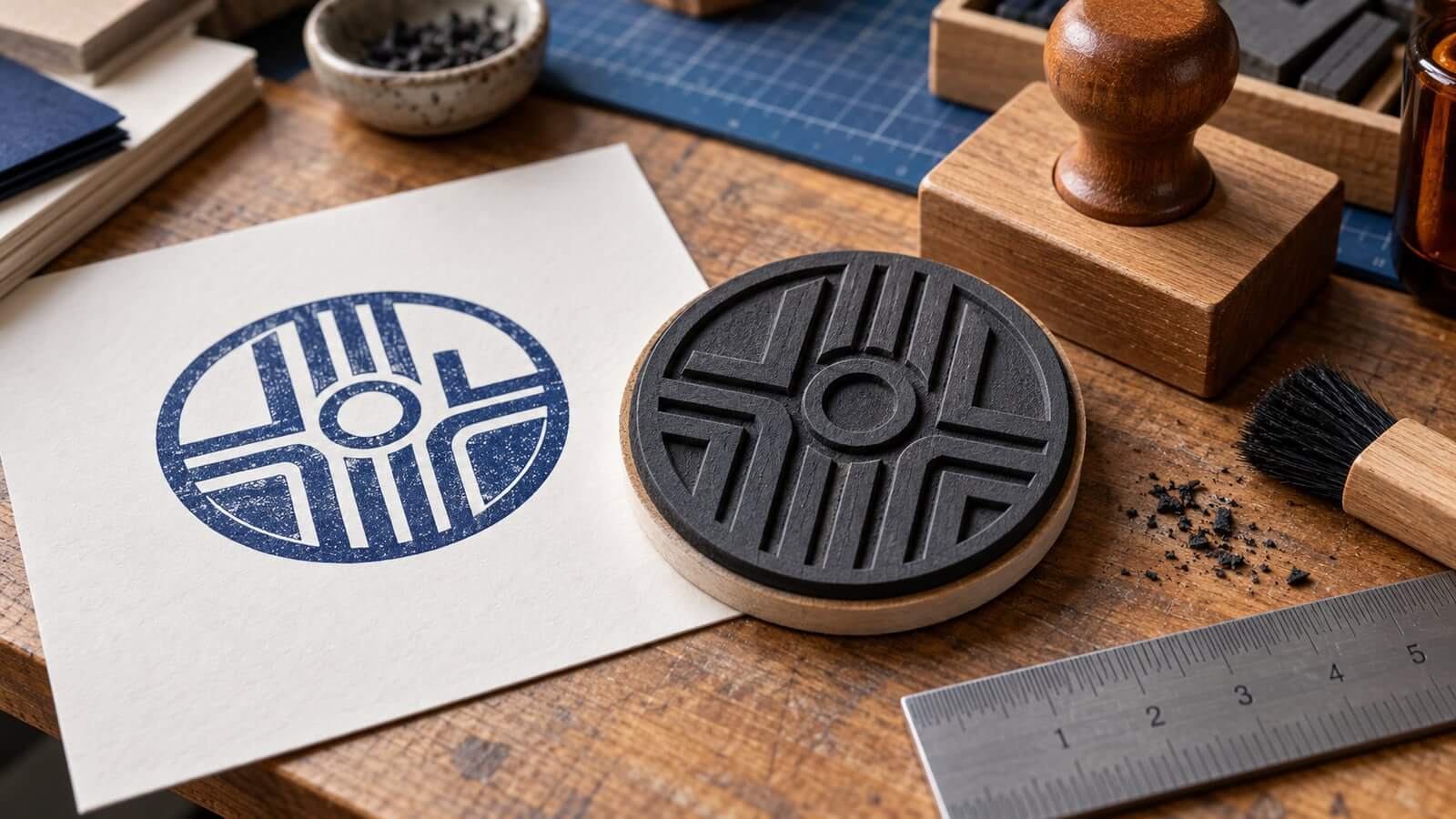
A designer sends a polished circular logo to a stamp supplier. The proof looks sharp at full-screen size, but the production operator pauses the job. The outer ring is too thin, two letters nearly touch, and the file has already been mirrored even though the engraving software mirrors stamp jobs automatically.
Nothing is wrong with the branding. The problem is the handoff. Screen artwork describes what the impression should look like; a laser process must turn that image into a raised rubber surface that survives cleaning, mounting, ink, pressure, and repeated use.
This guide focuses on that boundary. It does not prescribe laser power, speed, depth, or lens settings because those depend on the machine, rubber, exhaust system, plate size, and supplier process. Instead, it shows how to deliver a clear master, ask the right production questions, and approve a proof that reflects the finished impression.
The easiest reference for everyone is a positive image of the desired result: dark areas represent the ink that should appear on paper, and light areas remain unprinted. Keep that reading-direction proof at the front of the package.
The physical plate is the opposite kind of object. Its printing areas stand above the removed background, and the plate must be oriented so its impression reads correctly. Dedicated stamp modes in laser software may create the negative, mirror the layout, calculate a contour, and add supporting slopes around raised details.
That is why a designer should not transform the production file by habit. Some suppliers want normal-reading positive artwork and handle every production conversion. Others specify a prepared negative. Confirm the convention in writing.
Include three labeled views when ambiguity is possible:
desired-impression— normal reading direction;production-artwork— supplied according to the manufacturer’s request;size-reference— exact outside dimensions and intended device.
The desired impression is the authority for wording and orientation. The machine file is a means of producing it.
A laser removes rubber around the parts that will print. Those remaining characters and shapes need enough base support to resist movement and pressure. Engraving systems often call the sloped support around a raised element a shoulder.
A broad solid area and a fine letter do not behave identically. Equipment documentation commonly offers different shoulder profiles for large surfaces, ordinary text, and fine detail. The supplier selects a profile alongside the rubber and machine settings.
Design choices affect whether that geometry has room to exist. Two narrow letters placed too close together may leave insufficient valley space. A tiny dot may stand on a weak base. Closely spaced concentric rings may merge into one heavy wall. A delicate serif may look elegant in vector artwork but become fragile after the surrounding material is removed.
You do not need to design the machine shoulder manually unless the supplier requests it. You do need to provide enough visual separation that the production software can build stable relief.
Start with the exact approved wording. Use a to test the content in a plausible shape, then simplify before adding texture.
Lock the outside size
Set the intended impression width and height before refining small details. A design that succeeds at 50 millimeters may fail when reduced to 25. Do not approve at an unspecified “large enough” canvas.
Record whether the dimensions describe the visible impression, the plate, or the device’s maximum text area. Those measurements are related but not interchangeable.
Establish one dominant reading level
Choose the name, status, or symbol that must survive first. Secondary text should remain visibly subordinate without becoming hairline detail. If every line has equal weight, the supplier cannot solve the crowding without making editorial decisions.
Remove unsupported detail
Zoom out to actual size. Delete marks that no longer communicate. Simplify tiny counters, close letter spacing, and open narrow gaps. Use a reduced production version of a complex logo rather than forcing the full brand asset into a small plate.
Keep the master clean
Distress, ink gaps, and rough edges can imitate an old impression, but they complicate relief. Maintain a clean production master and treat texture as a separate approved variant. A manufacturer can make physical texture through the real ink process; fake damage is not always helpful.
A short technical exchange prevents more errors than a folder full of guessed formats.
1. What should the submitted artwork look like?
Ask whether the file should be positive or negative and normal-reading or mirrored. Do not accept “usual stamp artwork” as the entire answer when the orientation is unclear.
2. Which format preserves the intended geometry?
Many workflows benefit from vector paths for text, borders, and logos, while some engraving systems rasterize the job for production. Ask which source formats the supplier accepts and whether fonts should remain editable, be outlined, or be accompanied by a PDF reference.
The goal is not to send every format you can export. It is to send one editable or vector master, one stable reference, and any machine-ready derivative the supplier requested.
3. What minimum feature rules apply?
Request the supplier’s current limits for positive lines, reversed gaps, small text, isolated details, and border spacing at the chosen size. These rules depend on material and process. A limit copied from another shop may be wrong for this job.
4. Who creates the cut contour and mounting allowance?
Some stamp software generates an optimized contour around the layout. Other suppliers expect a defined boundary. Confirm whether the outside line is printed artwork, a cut path, or merely a visual guide. Confusing those roles can add an unwanted ring to the impression.
5. What proof will be supplied?
Ask for a proof that shows normal reading direction, final dimensions, device reference, and any production simplification. If the supplier changes thin lines or small letters, the change should be visible and approved rather than discovered in the first impression.
Use a small, explicit package rather than filenames such as final2-new.ai.
A practical set contains:
- a clean master with the approved geometry;
- a normal-reading PDF proof at actual size;
- the supplier-requested production file;
- a short specification with dimensions and device;
- a contact or role responsible for approval;
- a version number and date.
The guide to explains how to simplify identity assets before this manufacturing step. The laser handoff begins after the organization has approved that simplified artwork.
If multiple stamps share a design family, place them in separate versioned folders. Do not let a small address stamp overwrite the source for a larger packaging mark merely because their names are similar.
First review the positive impression. Check spelling, numbers, reading order, hierarchy, outside size, and protected clear space. This is the view that a normal reader will see.
Then review the production representation. Confirm that it corresponds to the positive proof and follows the supplier’s orientation convention. The second review is not an invitation to redesign; it is a transformation check.
Mark the proof status clearly:
- approved without change;
- approved with one listed correction;
- rejected and replaced by a new version.
Do not approve a screenshot that omits dimensions or file identity. A proof should be traceable to the exact production asset.
An engraved plate can look precise and still produce a weak print. Test on the intended ink and surface with ordinary operating pressure.
Inspect:
- whether small counters remain open;
- whether neighboring letters fill together;
- whether borders transfer evenly;
- whether isolated dots or fine strokes disappear;
- whether broad solids print patchily;
- whether the mounted orientation and device alignment are correct.
Repeat the impression several times. The first press after inking may be heavier than the next. A device intended for routine work should be judged across normal repeated use, not one carefully staged sample.
Keep one approved impression or high-quality scan with the order record. It becomes a useful comparison when the plate wears, the pad changes, or a replacement is produced.
When a proof fails, describe the visible symptom before guessing the cause.
Letters fill together
Check spacing, stroke weight, ink load, surface absorption, pressure, and shoulder interaction. Increasing every gap may fix one area and damage the overall word shape, so isolate the problem.
Fine lines disappear
Confirm that the lines exist in the production file, then ask whether they are stable for the material and size. Strengthen only the vulnerable details or create a simplified small version.
Background marks appear
Ask whether the nonprinting area, contour, cleaning, or mounting is responsible. Do not hide the symptom by shrinking the artwork until the cause is understood.
The impression reads backward
Compare the positive reference with the transformations applied by both designer and supplier. Correct the handoff rule so the next reorder does not repeat the mistake.
The border is uneven
Check the artwork, plate mounting, device alignment, pressure, and surface. A perfectly circular vector border can print unevenly if the plate or pressing action is not level.
Once the stamp passes testing, save the approved master, production derivative, supplier proof, dimensions, device model, plate material, and sample impression. Record any accepted simplifications.
Do not assume the supplier will retain every file indefinitely or that the next order will use identical equipment. Your internal master should remain readable without proprietary machine settings. Production parameters belong with the manufacturer; approved content and geometry belong with the design owner.
The can support future layout work. The reorder record prevents those future edits from silently replacing the version already in service.
Should I mirror laser-engraving artwork myself?
Only when the supplier instructs you to do so. Dedicated stamp modes may mirror and invert the design automatically. Always include a normal-reading impression proof.
Is SVG always the best production format?
Not always. Vector geometry is useful, but the accepted format and font treatment depend on the supplier’s workflow. Send the requested format plus a stable PDF reference.
What is a shoulder on a rubber stamp plate?
It is the sloped support around raised printing elements. The profile helps characters and shapes remain stable, and its setting is normally handled in the engraving workflow.
Can a detailed logo be laser engraved unchanged?
Sometimes at a large size, but small stamps often need a simplified production version. Test counters, gaps, thin lines, and isolated details at the final dimensions.
Who should approve the final proof?
An authorized owner should approve wording and identity, while the supplier confirms manufacturability. Neither review replaces the other.
A reliable laser-engraved stamp begins with a normal-reading, actual-size definition of the intended impression. Keep the source clean, ask the supplier who performs each transformation, and approve a traceable production proof.
Do not guess machine settings or mirror artwork by tradition. Give the engraver clear geometry and clear decisions, then judge the real impression on the real surface. That boundary keeps design ownership intact while allowing the manufacturer to control the process it understands best.
