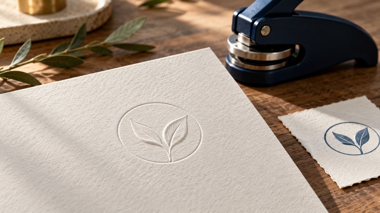
Imagine a stationery buyer approving a navy emblem for correspondence cards. The thin inner ring looks crisp, and a pale blue leaf adds depth. The buyer then sends the same image to an embosser supplier, expecting the design to appear exactly as it does on screen, only raised. But without ink, the two blue tones no longer explain which leaf overlaps the other.
Embosser artwork needs a separate production decision. An ink stamp deposits a colored mark; a paper embosser changes the paper's shape. A design can share the same name and recognizable silhouette across both methods without using an identical production file.
For ordinary decorative stationery, the goal is to preserve identity while adapting the detail, placement, and proof process to raised paper. This guide covers that adaptation. It does not address regulated seals or suggest that a decorative impression confers official authority.
Blind embossing produces a raised impression without adding ink to the design. Its visibility depends on the physical relief and how light falls across it. A dark blue mark remains dark blue in a flat photograph; an uninked raised mark may look strong from one angle and subtle from another.
Do not judge the proposed result using a digital bevel filter. A filter can illustrate a visual idea, but it cannot establish how a particular paper will respond to the supplier's die and device. The relevant proof is a physical impression on the intended stock.
Think of the two versions as different translations of the same identity:
| Design feature | Ink-stamp question | Embosser question |
|---|---|---|
| Fine border | Does it print continuously? | Does it form a distinct raised edge? |
| Two touching shapes | Does color or white space separate them? | Will the relief make their relationship understandable? |
| Small wording | Can the inked letters be read? | Can the letters be read in ordinary light on this paper? |
| Placement | Can the tool reach the blank area? | Can the sheet enter the embosser in the required direction? |
Neither column replaces supplier advice. The comparison tells you which questions the artwork proof must answer instead of assuming that success in one process predicts success in the other.
Start with the actual sheet or card. Record its product name, dimensions, weight designation, finish, and whether it is already printed or folded. Send a sample when the supplier requests one. A description such as “premium thick paper” does not give a maker enough information to confirm suitability.
Embossers have device-specific material limits. StampMaker's published FAQ, for example, restricts its embossers to a particular paper weight and warns about both thicker card and thin tissue. That is evidence to check the chosen tool, not a universal rule that every embosser works on the same stock.
Ask the supplier to confirm the combination of device, design, and paper. If any part changes, ask whether the existing approval still applies. A die approved for a simple emblem on one sheet does not automatically settle a complex design on a different card.
Give the reverse face a job too
An embossed card has a back as well as a front. Identify anything printed or written behind the proposed impression. The reverse appearance may be acceptable on a decorative card but distracting on a two-sided insert with closely spaced text.
Include both faces in the layout review. If the back must remain visually quiet, discuss another location or a different production method. Do not hide the reverse face from the approver because it is less attractive than the front.
Remove color from the planning proof and ask what still communicates the design. Two overlapping leaves that were separated by light and dark blue may now appear as one solid shape. A faint background ring may compete with the main outline when both are represented as raised elements.
Begin with the essential silhouette. Then retain only the internal lines that explain the symbol or wording. A useful revision may separate two shapes, remove a decorative vein, or replace a shaded area with a simpler contour. These are design options to review, not guaranteed manufacturing fixes.
The can help you explore a clear emblem before requesting production advice. Use them to organize the content and proportions. A digital layout is not an embosser die specification or a promise that a supplier can manufacture every detail.
Avoid assigning depth through gray shades
Do not assume that pale gray in an image means a shallow emboss and black means a deeper one. Unless the supplier explicitly requests a depth map with defined conventions, that interpretation is ambiguous. Provide the kind of artwork the maker asks for and keep visual mockups separate from production files.
Similarly, a white area might represent a gap, a recessed region, or simply the page background in a mockup. Agree on what each element means. A short written description such as “raised outer contour with an open center” is more useful than expecting the supplier to infer construction from a shaded preview.
Small wording often carries more detail than the emblem. Inspect the open spaces inside letters, the gaps between characters, and the distance from text to border. If these areas already look cramped in the flat proof, ask the supplier to assess them before you approve the die.
There is no single line width or font size to prescribe for every embossing setup here. Use the chosen supplier's requirements for the exact process and stock. Treat any minimum as a production constraint, not a target that every letter should approach as closely as possible.
Prefer a shorter secondary phrase to squeezing the entire design. A studio name may be essential, while a decorative descriptor can appear elsewhere on the stationery. Removing unnecessary text can preserve a recognizable identity without forcing a larger impression onto a small card.
For rubber production, the explains a different handoff. Keep those files distinct. Instructions for engraving an ink-stamp face do not automatically describe how an embossing die should be prepared.
Send a placement drawing, not just a cropped emblem. Show the whole page, the intended impression, and the edge that will enter the device. Mark the top of the finished page in the proof outside the production artwork. If the piece folds, show the fold and the state in which it will be embossed.
Ask the maker to confirm reach using an agreed measurement reference. “Near the corner” can mean the distance to the impression's edge or its center. State which one you mean and confirm that the device can place the complete design there.
Orientation should be resolved before die mounting. Supplier Pickled Stamps requests normal-reading artwork and handles die preparation itself. Follow your own supplier's instructions rather than mirroring or rotating the file based on a general tutorial. A normal-reading reference should accompany any special production file so the intended result stays unambiguous.
For a bookplate or folded card, include a simple paper dummy. Turn it as the operator would, insert the relevant edge, and identify the desired reading side. This rehearsal is a layout check; it does not require pressing an unsuitable material into a device.
Consider a fictional craft studio with an emblem containing two leaves, its name, a small descriptor, and a double border. The ink version uses navy for the outer leaf and a lighter tint for the inner one. It is intended for a packing slip. The embossed version will appear on a correspondence sheet.
For the ink proof, the team keeps a single-color interpretation with a clear gap between the leaves. The descriptor remains because it can be read at the chosen size. The proof is evaluated as an ink impression, not as an embossed object.
For the embossing proposal, the team removes the descriptor and the inner border. It separates the leaf contours and asks the supplier whether their spacing is suitable for the selected paper. The main name and overall shape remain recognizable, so the two versions still belong to the same identity.
The team also changes placement. The packing slip has a blank central area, but the correspondence sheet requires a position reachable from its bottom edge. That difference belongs in the placement drawing, not in a last-minute instruction after the die has been made.
This example describes an approval approach, not a tested design or a result from a real customer. The supplier's physical proof decides whether the proposed simplification works.
Separate the files by purpose so a polished mockup cannot be mistaken for manufacturing artwork. A useful packet contains:
- the requested artwork format at the agreed finished size;
- a normal-reading reference identifying essential content;
- a whole-sheet placement drawing with entry edge and reading side;
- the paper specification and any requested physical samples;
- written questions about the smallest details and reverse-face appearance.
Name the contact who can approve changes. If the maker recommends removing a line or opening a gap, review the revised proof against the identity rather than approving it through an informal message with no file attached. Keep the exact approved version with the order.
SealsDigital belongs at the visual-design stage of this process: arranging an emblem and preparing a clear reference. The covers related artwork decisions. Physical embossing suitability, die construction, and device selection still require confirmation from the supplier producing the tool.
Look at the physical proof under the lighting in which the stationery will normally be handled. Then tilt it to inspect the relief. A dramatic side-lit photograph can help reveal surface detail, but it should not be the only basis for judging everyday readability.
Check the front and back for unintended damage, distracting distortion, and missing or merged details. Compare the placement with the full-sheet proof. Ask another reader to identify the wording without first showing them the digital version; familiarity with the design can conceal a difficult letter.
If the sample disappoints, describe the observed problem precisely. “The lower word is difficult to read under desk lighting” is more actionable than “Make it stronger.” Ask the supplier whether artwork, paper, device suitability, or production preparation needs revision. Do not compensate by exceeding the maker's operating instructions.
Can one logo file serve both an embosser and an ink stamp?
It can be a shared starting source, but approve separate production versions. The identity may remain consistent while line spacing, small text, and placement differ. Keep both approved proofs so a future reorder does not substitute one version for the other.
Does a black-and-white file specify embossing depth?
Not by itself. The supplier must define how the artwork maps to the die. Do not use shades or filters to imply a depth system that the maker has not agreed to interpret.
Should I mirror my artwork before sending it?
Only if the supplier explicitly requests that preparation. Send a normal-reading reference in all cases and confirm the finished reading side. Let the maker resolve production orientation rather than guessing from the appearance of a die photograph.
Will an embossed mark remain visible in a scan?
Do not assume so. Test the actual impression through the scanning process if a digital copy matters. If the content must be readable in the copy, discuss a separate printed treatment rather than relying on subtle relief alone.
Is a digital emboss effect equivalent to a paper embosser?
No. It is an image treatment. It can illustrate an idea on screen but cannot create raised paper or establish whether the intended stock and tool will reproduce the artwork successfully.
Prepare an embosser as a paper-production project, not an ink stamp with its color removed. Confirm the stock, simplify the relief artwork, document the entry edge, and review both faces of a physical proof. The finished impression should carry the intended identity in ordinary handling, not only in a carefully lit mockup.
