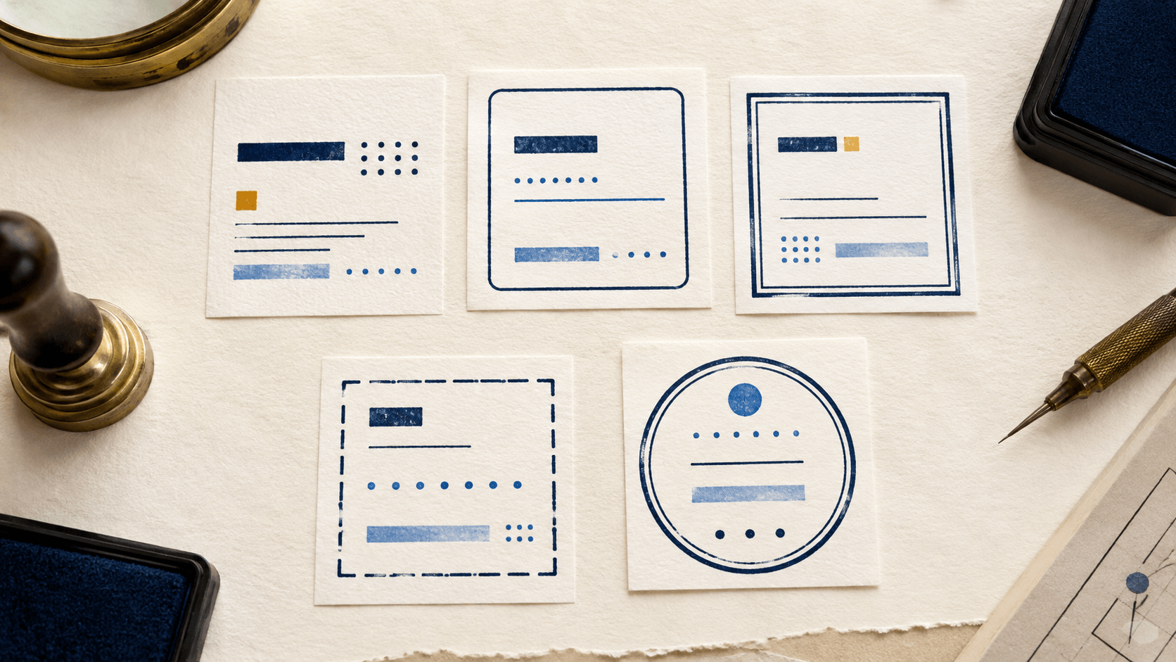
The wording of a new stamp is short and clear, but the proof still feels crowded. The designer has added two outer lines, an inner divider, rounded corners, and small breaks for decoration. The border now carries more visual weight than the message it was supposed to organize.
A border is not a certificate of quality or authority. It is a frame. It can group content, establish a silhouette, protect empty space, and make placement easier. It can also trap text, merge during reproduction, or make an ordinary status look more formal than intended.
Compare borderless, single, double, broken, rounded, square, rectangular, and circular treatments against the same content. The right frame is the one that supports the stamp's job at its real size.
Before drawing a line, state what the border needs to do.
Possible jobs include:
- separate the stamp from nearby document text;
- create a stable shape for placement;
- keep curved lettering aligned around a center;
- divide fixed wording from a writing field;
- make related marks feel like one family;
- contain an intentionally distressed impression.
If the border has no job, remove it from the first proof. A borderless version provides a useful baseline. You may discover that strong type and consistent spacing already create enough structure.
Do not choose a complex border merely because it resembles a traditional seal. Decorative rings and formal geometry can suggest institutional authority that the mark does not possess. A visual frame does not create approval, authenticity, legal effect, or official status.
A can provide a neutral canvas for comparing frame options. Keep the same wording and inner layout while changing only the border so the comparison remains meaningful.
A borderless stamp can feel direct and modern. It works well when the primary word has a strong silhouette, the placement zone is predictable, and surrounding content leaves sufficient quiet space.
Common uses include a short internal status, a small brand wordmark, or a digital mark placed inside an existing document panel. Because there is no outer frame, the artwork can use its available size for letters rather than lines.
The risk is drift. On a busy page, borderless text may look like ordinary document content. Users may also crop it inconsistently because the visual bounds are less obvious. Solve those issues with a controlled transparent margin and a documented placement zone.
Do not add a shadow or glow automatically to make borderless text stand out. Those effects can soften small letters and behave unpredictably on different backgrounds. Test a simple solid version first.
A single border is the most flexible starting point. It creates a recognizable object without consuming much internal space.
Match its weight to the primary lettering. If the line is much heavier, the eye sees the container before the message. If it is much lighter, it may disappear while the content remains. The two do not need identical thickness, but they should feel related at intended size.
Leave enough inner margin that letters do not appear to touch the frame. The border should protect the content, not squeeze it. Check rounded letters and diagonal strokes carefully because their optical distance can differ from a measured rectangular margin.
A single rectangular frame suits linear reading and fielded layouts. A single circle suits a compact central identity or short curved text. A rounded rectangle can soften an office status without sacrificing the left-to-right structure.
Double borders can create depth and a strong seal-like silhouette. They are useful when two rings organize curved text, or when an inner frame separates content from a heavier outer edge.
They also consume space twice: once through the lines and again through the gap between them. On a small stamp, that cost can force text inward. Close parallel lines may merge in an inked impression, low-resolution image, scan, or print.
Use the when the design genuinely needs concentric rings and curved wording. Its circular focus helps distinguish a structural ring system from decoration added after the layout is already crowded.
Compare the double border with a single-border proof at actual size. If removing one line improves the main message without losing organization, the simpler frame is doing the job better.
A border may open for a word, date field, banner, or central symbol. The break can create hierarchy and reduce the feeling of a closed box. It can also look accidental if its width and alignment are not controlled.
Anchor every break to content. A top opening might hold a primary word. Side gaps might align with separators. A lower opening could make space for a date field. Random gaps added for texture should not resemble missing ink unless that distressed character is intentional.
Keep the endpoints visually stable. Tiny detached fragments near an opening can reproduce as specks. Very short border segments may disappear. Test the design both clean and with the intended texture before deciding which pieces belong.
When a border passes behind a banner, decide whether the hidden line should truly be removed or merely covered in the artwork. A clean master with explicit geometry is easier to edit later than a collection of overlapping patches.
Corner style changes the tone and space of a rectangular stamp.
Square corners feel direct and align well with tables, labels, and structured fields. Rounded corners can feel friendlier and reduce the sharpness of a compact status. Cut or decorative corners create a stronger visual identity but demand more room and careful reproduction.
Do not force rounded type into a rounded rectangle or angular type into a square frame by habit. Contrast can be useful. Judge the complete silhouette and reading order.
Corner radius should remain visible at use size. A tiny radius may reproduce as an imperfect square. An oversized radius can turn a short rectangle into a capsule and reduce space near the ends. Place the longest approved line inside the frame before finalizing the corners.
For physical production, confirm that small corner details suit the chosen process and supplier. For digital placement, inspect corners against light and dark backgrounds for partial transparency or rough pixels.
Round borders naturally focus attention toward the center and can support curved text. Rectangles support rows, dates, references, and left-to-right reading. Squares suit compact blocks with balanced line lengths. An oval can hold a wider name while keeping a seal-like silhouette, but it needs careful spacing at the narrow ends. The shows how to use that central width without crowding the tapered sides.
Do not start with a fashionable shape and force the content inside. Write the exact message and fields first. Sketch their natural reading order. Then compare two or three containers around the same inner layout.
If the stamp includes a handwriting area, a rectangle often offers more predictable space. If it contains a short identity around a monogram, a circle may provide clearer hierarchy. If it is a one-word status used inside a document table, no border or a simple rectangle may be enough.
Shape is a practical decision, not a statement of legal authority.
The inner quiet zone separates content from the border. The outer quiet zone separates the stamp from the document.
Build from the content outward. Set the wording and fields, add comfortable internal spacing, then place the border. Add a small transparent margin outside the frame so it is not clipped during placement. Keep that outer margin even unless a template requires a specific anchor.
Test the quiet zones with the busiest legitimate wording. Placeholder text can hide future crowding. A department with a long name, a full date format, or a reference field may need more space than the sample.
Avoid solving a tight inner margin by shrinking all type. Remove unnecessary content or enlarge the intended stamp first. If neither is possible, design a simpler companion version for the smaller destination.
The border, primary text, secondary text, and dividers form a weight system. They should not all shout.
View the stamp from a distance or reduce it to intended size. If the border becomes a solid shape around a gray center, it is too dominant. If the frame disappears and the content feels loose, it may be too light or too distant.
Try changing one variable at a time:
- line weight;
- distance from content;
- number of border lines;
- corner or ring shape;
- amount of texture.
Changing all five between proofs makes it difficult to understand why one version works. A controlled comparison produces a decision the next editor can repeat.
Keep dividers quieter than the outside frame unless a field boundary is the most important part of the mark. A heavy grid can make the stamp resemble a form and compete with handwritten entries.
Distressed borders can give a stamp an inked character, but texture should be applied after the clean geometry is approved. Keep a clean master.
Use texture to soften uniformity, not to hide structural mistakes. Breaks should not remove corners, close letters, or create false punctuation. Compare several random textures at normal size and reject patterns that damage the same essential area repeatedly.
Digital artwork may need a lighter texture than a large physical impression because small transparent gaps can become noisy over document content. Physical output depends on the material, ink, surface, pressure, and production method. Ask the supplier for a proof when the border pushes fine detail.
Label clean and distressed exports by purpose. Do not let users choose between them based only on which looks more dramatic.
Create a proof sheet with the exact same inner content in several frames:
- borderless;
- single line;
- double line;
- rounded rectangle;
- broken border.
Show each at intended size and on the real destination background. Add a larger detail view for inspection, but make the decision from the use-size proof.
Ask reviewers to score practical questions rather than taste alone:
- Which version reveals the main message fastest?
- Which leaves enough room for required fields?
- Which remains distinct after export or print?
- Which fits the document without covering nearby content?
- Which tone matches the actual process without overstating authority?
Record the selected frame and the reason. If the wording or destination changes later, the team can revisit the decision instead of repeating the entire debate.
Related stamps benefit from a shared frame logic. They do not need identical borders.
For example, routine statuses might use one rectangular line, exception marks might use a broken frame, and a brand identity mark might use a circle. Keep consistent margins, corner logic, and general weight so the family feels intentional.
Avoid assigning meaning that users have not been taught. A double border should not silently mean “final” while a single border means “draft.” If border style carries operational meaning, document it and include examples in training.
The contains additional examples across design and workflow contexts. Use them to compare approaches, then return to the exact message, size, and destination of your own stamp.
Before approving the design, confirm:
- the border has a named function;
- the main message remains visually dominant;
- inner and outer quiet zones are sufficient;
- parallel lines remain distinct at use size;
- corners and openings look intentional;
- the shape follows the information flow;
- clean geometry exists beneath any texture;
- the frame works on the real destination background;
- related marks follow a documented family rule;
- no visual treatment implies authority the workflow does not provide.
Does every stamp need a border?
No. Borderless designs can work when the text has a strong silhouette and the placement area provides enough separation. Test a borderless proof before assuming a frame is necessary.
Is a double border more professional?
Not automatically. It can support a circular structure, but it also consumes space and may merge at small sizes. Professional results come from clear hierarchy and reliable reproduction, not the number of lines.
How much space should sit between text and border?
There is no universal value for every size and process. Leave enough room for letters, counters, and writing fields to remain distinct at the intended output. Judge the actual-size proof.
Can a border make a digital stamp official?
No. A frame may suggest a tone, but it does not create legal effect, authorization, identity proof, or government approval. Those come from the applicable process and rules.
Should digital and physical versions use the same border?
They can share the same structure, but fine details may need controlled adjustment for different output methods. Keep the meaning and identity consistent, document variants, and test each destination.
A useful stamp border separates, organizes, and protects the content. Start without one, add the simplest frame that performs a real job, and compare alternatives with the same inner layout at actual size.
When the border becomes the first thing people notice, simplify it. The message and required fields should lead; the frame should make them easier to read, place, and reproduce.
