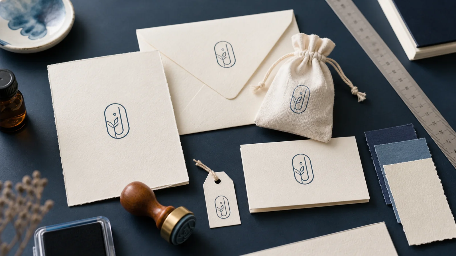
The invitation proof looked balanced on a full sheet. Then the same monogram was reduced for a narrow favor tag, and everything that made it distinctive disappeared. The date closed up, the border crowded the initials, and the smallest floral details became a dark ring.
That is a common wedding stamp design problem. A couple may want one visual mark across envelopes, RSVP cards, place cards, favor bags, programs, and thank-you notes, but those pieces do not offer the same space or surface. Simply scaling one elaborate design up and down rarely produces a coherent set.
A better approach is to design a small system. Keep one recognizable core, decide which details are optional, and proof every version at the size where it will actually appear. You can explore a starting layout with the , but the decisions below matter before any design is treated as final.
Do not begin by choosing a border or script font. Begin with an inventory of surfaces.
Lay out one example of every item that may carry the mark:
- outer invitation envelope;
- RSVP envelope or card;
- invitation insert;
- ceremony program;
- place card or escort card;
- menu;
- favor tag, bag, box, or label;
- thank-you card and envelope;
- digital itinerary or guest information sheet.
Measure the clear area on each piece. Exclude folds, envelope seams, punch holes, ribbon, adhesive zones, and any area that already contains essential text. The smallest clear area is usually the most demanding. It may be a narrow tag rather than the main invitation.
This inventory prevents a subtle mistake: designing the wedding invitation stamp as if the invitation were the only use. The main card can hold names, a date, a place, an illustration, and a border. A small favor tag may hold only initials and one simple shape.
The goal is not to force every detail onto every item. It is to decide what makes the mark recognizable when only the essentials remain.
A flexible personalized wedding stamp usually needs a fixed core. That core might be:
- two initials in a distinctive arrangement;
- a short shared name;
- a simple symbol paired with the initials;
- a clean monogram inside a recognizable outline.
Everything else can be optional. The wedding date, location, botanical decoration, or surrounding phrase may appear on larger pieces and disappear from smaller ones.
Try describing the system in one sentence: “The interlocking initials always stay; the date appears on pieces wider than 45 mm; the floral border is used only on the invitation and program.” A rule like that gives a stationer, planner, family member, or printer a consistent basis for decisions.
If you need a structured starting point, the editable can help you compare monograms, motifs, and shapes. Treat it as a working canvas. Remove anything that does not survive the smallest intended size.
Wedding stationery often combines script lettering with small supporting type. The contrast can be elegant, but only when each style has a clear job.
Use expressive lettering for the part that deserves attention: initials, a short surname, or one brief phrase. Use a quieter serif or sans-serif for dates and supporting words. When every line uses an ornate script, the mark loses hierarchy and becomes harder to scan.
Pay special attention to pairs of initials with similar shapes. An uppercase C can merge into a decorative G; an I can disappear beside a flourish; two crossed stems can look like an accidental line. Print several arrangements rather than judging them at a large zoom level.
Curved text needs extra space. Letters that look evenly spaced on a straight baseline may bunch together near the sides of a circle. The explains how tracking, weight, and curved baselines affect legibility. For a wedding mark, restraint is usually more useful than adding another flourish to fill an empty gap.
Check the hierarchy by covering parts of the proof with a piece of paper. If the initials remain clear without the date and ornament, the core is doing its job. If the design becomes meaningless as soon as the border is hidden, the center needs more identity.
Open the design at its final physical size, not at the comfortable size of the editor window. Print it at 100 percent and cut around the intended boundary. Place the proof on the envelope flap, tag, bag, and card.
For the smallest version:
- remove secondary wording;
- simplify fine leaves, lines, and interior gaps;
- enlarge the open spaces inside letters;
- keep a calm margin around the mark;
- test it in one color before considering special finishes.
Now create a larger version by adding only the details that help. This reverses the usual process. Instead of designing an elaborate invitation mark and stripping it down reluctantly, you begin with a strong compact mark and expand it deliberately.
The technique is especially useful when the wedding favor stamp will appear on several kinds of packaging. A paper box, fabric bag, glassine envelope, and card label each create different constraints. The broader guide to covers surface tests, placement, and modular marks that also apply to event favors.
Round wedding stamps are popular because they frame monograms naturally. They work well on envelope flaps, circular labels, and centered tags. They are not automatically the best choice for every suite.
A horizontal rectangle may fit a return address or shared surname more efficiently. A narrow oval can suit a long pair of names. A square can feel contemporary and align cleanly with grid-based stationery. An unbordered mark can be the most adaptable when the surrounding paper already supplies a strong shape.
Before choosing, draw the available area on a blank sheet and test three rough silhouettes inside it. Look at how much space remains around the initials. A border should organize the composition, not squeeze it.
If a circle is the best fit, review the practical layout choices in the . Keep the center simple, give curved lettering enough room, and avoid stacking several rings merely because the format allows them.
The suite does not need identical outer shapes everywhere. The same monogram can live in a circle on an envelope and without a border on a small tag. Consistency can come from the initials, type, line weight, and spacing rather than from one rigid container.
Color on a screen is not the same as an impression on paper or packaging. A muted green may look crisp on a white digital proof and become low contrast on kraft stock. Metallic or opaque inks can behave differently from ordinary office ink. Coated, textured, dark, and absorbent surfaces all deserve their own test.
Create a small material board with the actual stocks or the closest samples available. Test the intended mark on each one. Record:
- ink or print color;
- paper or packaging stock;
- drying time observed in the test;
- pressure or application method;
- whether fine details stayed open;
- whether the reverse side showed transfer;
- whether stacked pieces picked up ink.
Do not turn one successful sample into a universal production claim. Test the exact ink, surface, and equipment that will be used for the final pieces. Ask a supplier for its artwork requirements before promising a finish or minimum detail.
For digital pieces, preserve a transparent-background version and a vector master. The article on can help distinguish a quick-use raster file from a scalable production handoff. SealsDigital currently offers PNG, JPG, SVG, EPS, PDF, and DOCX export options, but the recipient should still confirm which file fits the software or production process in use.
Once the design variants pass their size tests, map each item to a specific file and method. A compact table is enough:
| Item | Mark version | Size | Color | Method | Owner |
|---|---|---|---|---|---|
| Invitation envelope | Round monogram + date | Final measured size | Dark green | Supplier or hand stamp | Stationer |
| Favor tag | Initials only | Final measured size | Dark green | Hand stamp | Packing team |
| Thank-you card | Monogram without border | Final measured size | Black | Digital placement | Designer |
Use real measurements in the working version of the table. Name the exact approved file rather than writing “logo.” Include an owner for each production step, especially when family members, vendors, and a planner are sharing the work.
The map also reveals unnecessary complexity. If four nearly identical variants are assigned to four items, combine them. If one mark requires three ink changes during favor assembly, simplify the plan before the packing day.
Keep one folder containing the editable master, approved exports, actual-size proof, and production map. The online can remain the route back to the editor and related design guidance, while the folder becomes the controlled handoff for this particular event.
Proofing is more than checking spelling on a large PDF.
First, verify the content
Check every name, initial order, date, punctuation mark, and location reference against the approved stationery copy. Decide how initials should be arranged and document the rule. Do not assume every viewer will interpret a decorative monogram in the intended order.
Second, verify actual size
Print each version at 100 percent. Place it on the correct item. Ask someone who did not build the design to read it without explanation.
Third, test production
Make a small batch using the final stock, ink, printer, or supplier proof. Test stacking, handling, and packing rather than inspecting only a fresh impression.
Fourth, photograph the assembled set
Put the invitation, envelope, favor, program, and thank-you piece together. The photograph will expose repetition and imbalance. If the monogram appears at the same visual weight six times, reduce or remove it on secondary pieces.
Fifth, lock the approved files
Move discarded drafts out of the production folder. Use clear filenames such as wedding-monogram-envelope-approved.svg and wedding-monogram-favor-tag-approved.png. Avoid a chain of final, final-2, and final-new files.
The tag version looks like a blob
Remove the date and outer decoration. Open the letter spacing, enlarge the central gap, and test a borderless version.
The initials are ambiguous
Separate them slightly or choose a simpler arrangement. Add full names elsewhere in the stationery rather than forcing them into the mark.
The envelope looks crowded
Reduce the stamp size or move it to the flap. Leave clear space around addresses, postage, and essential printed information.
The favor packaging looks like a different event
Keep one invariant from the main suite: the same initials, line weight, color family, or small motif. Do not solve the mismatch by copying every invitation detail onto the favor.
Digital and physical versions feel inconsistent
Compare both against the same approved master. Differences in color and texture are expected, but the proportions, spacing, and core identity should remain recognizable.
Should one wedding stamp be used on every item?
One core design can guide the suite, but not every item needs the full version. Use a compact version for small tags and reserve extra wording or decoration for larger pieces.
What should a wedding monogram include?
Include only what stays readable at the intended size. Two initials may be enough. A date or simple motif can be added when the surface offers room and the hierarchy remains clear.
Is a round or rectangular wedding stamp better?
Choose by placement. A round mark often suits envelope flaps and centered tags; a rectangle may fit a return address, long surname, or narrow label more efficiently.
Which file format should go to a stationer or printer?
Ask the recipient. A vector format such as SVG or EPS can support scaling, while PNG is convenient for previews and many digital placements. The supplier’s workflow determines the final handoff.
How can we test the design without ordering a full batch?
Print actual-size proofs, place them on the real pieces, and produce a small sample using the intended material and method. Approve the assembled set before the complete run.
A successful wedding stamp is not the design with the most ornament. It is the one that remains recognizable on the smallest tag, feels proportionate on the invitation, and gives every person producing the suite a clear file and placement rule.
Build the compact core first. Add details only where they earn the space. Then lock the approved variants, material tests, and production map into one proof packet. That small discipline keeps invitations, favors, and thank-you pieces connected without making them look mechanically identical.
