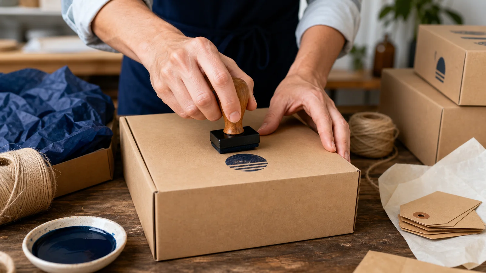
Packaging is one of the first places where a young product brand feels the tension between looking considered and staying flexible. Printed boxes can be expensive in small quantities, labels may need to change from one batch to the next, and a full packaging redesign can tie up cash before a product has proved its demand. A well-made stamp gives a small brand another option: buy plain materials and add a consistent mark when orders are packed.
That does not mean every parcel should look handmade or rustic. A stamp can be crisp, restrained, and modern. The result depends on the artwork, the surface, the ink, and how consistently the team applies it.
The useful question is not “How do we put our logo on everything?” It is “Which pieces of packaging need identity or information, and where can a stamp add it reliably?” Draft the mark in the , then test it on the exact stock and finish you plan to use.
A packaging stamp can serve several purposes, but one mark should not try to do all of them.
Brand recognition
A logo or wordmark on the outer box helps a customer recognize the sender. The same mark can appear on tissue, a thank-you card, or a paper bag, but it does not need to be repeated on every surface.
Product identification
A flexible text stamp can identify a scent, color, size, flavor, or batch on otherwise common packaging. This is useful when several products share the same box or pouch.
Handling information
Marks such as “fragile,” “keep dry,” or “this side up” communicate operational instructions. Use standard shipping labels where carriers or regulations require them; a brand stamp should not replace mandated markings.
Customer experience
A short “packed for you,” care instruction, or return reminder can add warmth. Keep it useful. Generic slogans on every flap can make the parcel feel busy rather than thoughtful.
For event favors that must match a broader stationery suite, the explains how to adapt one core mark across invitations, tags, and packaging without forcing every detail onto every surface.
Internal control
Small batch producers may stamp a pack date, checker initials, or batch reference. This is different from front-facing branding and should be designed for accuracy first.
List the jobs you need and rank them. The outer logo may deserve one polished stamp, while variable product details belong in a separate, simpler layout.
Logos made for websites often contain gradients, fine lines, small type, or multiple colors. Those features may not transfer cleanly to a single-color impression.
Create a stamp version of the identity rather than forcing the primary logo into a new medium. The stamp version may:
- remove a tagline;
- thicken thin strokes;
- open tight counters inside letters;
- simplify detailed illustrations;
- use one color;
- increase spacing around small elements;
- switch from a horizontal lockup to a compact one.
These changes do not weaken the brand. They help it remain recognizable under real production conditions. The explains how to simplify shapes without losing the essential identity.
A is a useful canvas, but begin with a clean vector or high-resolution source. Do not trace a compressed screenshot if the original artwork is available.
Ink behaves differently on every material. An impression that looks sharp on uncoated card may smear on a coated box or bleed into soft tissue.
Kraft and uncoated cardboard
These surfaces usually accept ink well, but recycled fibers and texture can break fine lines. Bold shapes and open lettering perform better. Brown stock also changes perceived color; test white, black, dark blue, or another opaque option rather than judging from a screen.
Tissue paper
Tissue is thin, absorbent, and easy to crease. Use light pressure and avoid overly wet ink. Large solid areas can show through or make sheets stick together. A smaller outline design is often more reliable.
Coated boxes and glossy labels
Standard water-based ink may sit on the surface and smear. You may need a fast-drying ink designed for nonporous materials, along with more drying time. Confirm compatibility and safety information from the ink supplier.
Fabric bags
Fabric texture interrupts fine detail. Use textile ink when appropriate, place a flat support inside the bag, and test wash or rub resistance if the bag is intended for reuse.
Wood
Grain and unevenness create a characterful but inconsistent result. A simple, bold design works best. If consistency matters more than texture, a printed label may be the better choice.
The broader is written with record longevity in mind, but its central lesson applies here: the artwork cannot compensate for an incompatible ink and substrate.
Brands often design for the largest box because it offers a generous canvas. The stamp then feels oversized on a small mailer or thank-you card.
Measure the clear area on every package you expect to use. Exclude seams, folds, tape paths, shipping labels, and areas likely to be crushed. If one stamp must work across the range, size it for the smallest useful surface.
A compact logo around 35–50 mm may suit many cards and small boxes, but there is no universal size. A long wordmark may need a wider rectangle. A small circular icon may remain legible at a smaller dimension.
Print the digital artwork at several real sizes. Cut the paper out and place it on the package. This low-cost step catches proportion problems before you order physical equipment or prepare a large batch.
Packaging often contains other strong elements: courier labels, tape, barcodes, product labels, and regulatory copy. The stamp needs clear space around it.
Choose a primary placement and write it into the packing guide. Examples include:
- centered on the top panel;
- 20 mm from the lower-right corner;
- on the inside lid;
- centered on a tissue seal;
- on the back of a thank-you card.
Consistency matters more than mathematical perfection. A simple placement jig can help when a team stamps many boxes. Even a piece of card cut to the correct offset can guide the corner position.
Do not place branding where shipping tape will split it or a courier label will cover it. Keep batch and care marks away from decorative areas if the customer needs to read them.
A stamp impression normally uses one ink at a time. That limitation can improve the identity by forcing a clear hierarchy.
Choose a core ink color that works on the main packaging stock and sits comfortably beside printed labels. Black is versatile, but navy, deep green, burgundy, or a brand-specific dark color can feel distinctive without losing legibility.
If you use several colors, give each a defined role. For example:
- navy for external brand marks;
- green for checked or packed status;
- red only for urgent handling information.
Avoid switching colors casually from order to order unless variation is part of the brand. Customers may read color changes as inconsistent quality.
In the digital artwork, keep the source color editable. Export a transparent version so a printer, designer, or document workflow can apply the appropriate color later.
A logo changes rarely. Product names, batch numbers, dates, sizes, and campaign messages change often. Combining them all in one physical stamp can create waste.
Use a modular system:
- one permanent brand mark;
- one product-family or collection mark;
- a small date or batch tool;
- printed or handwritten variable details;
- a separate care or return card.
This lets the business update one component without replacing the full set. It also reduces errors because packers do not need to search through many nearly identical logo stamps.
A membership business uses a similar modular idea in the : keep the identity stable while allowing the contents and message to change.
Stamped packaging will naturally show slight variation. Decide what counts as acceptable before a busy launch day.
An acceptable impression should be:
- complete enough that the logo is immediately recognizable;
- straight within a reasonable visual tolerance;
- dry before it contacts another surface;
- free from accidental double impressions;
- placed in the agreed area;
- clear of required labels and product information.
Make a one-page reference with three examples: acceptable, rework, and discard. This is more useful than asking every packer to use personal judgment.
Not every imperfect mark requires a new box. A light impression on tissue may still look intentional. A smeared mark covering a product label does not. Define the line based on customer clarity and operational risk.
Good artwork can still produce poor packaging when the station is improvised. Provide:
- a flat, stable stamping surface;
- the correct ink pad;
- scrap stock for a first test;
- a cleaning cloth and approved cleaner;
- a drying area;
- a placement guide;
- a place to store the stamp face-up or protected;
- written instructions for ink replacement and cleaning.
Test the stamp once at the start of a packing session and after long pauses. Ink can accumulate around fine details. Clean according to the stamp and ink manufacturer’s guidance rather than scraping the surface with sharp tools.
If several people pack orders, train them to use even pressure and lift straight up. Rocking the stamp can blur edges. Too much pressure can transfer ink from the surrounding base.
Hand stamping is flexible, but it adds labor. Time a realistic batch:
- prepare 25 packages;
- stamp them using the intended placement;
- allow the required drying time;
- count rework;
- calculate labor per package.
Include setup and cleanup, not just the moment of stamping. A design with a huge solid area may take longer to ink consistently. A mark placed inside a box may interrupt assembly.
When volume grows, compare the cost and consistency of preprinted packaging, labels, digital printing, or automated marking. A stamp is not automatically the cheapest option at every scale. Its advantage is flexibility, especially during early runs, seasonal changes, and product testing.
Food, cosmetics, supplements, electrical products, children’s products, and other regulated categories may require specific labels, warnings, traceability, or durability. Do not assume a decorative stamp satisfies those requirements.
Keep mandatory information in the approved labeling system unless a competent adviser and production test confirm that a stamped method is compliant. Check legibility, permanence, placement, and language rules for the markets where the product is sold.
Batch or date stamping may be part of a traceability system, but the process must prevent incorrect or unreadable values. A free-form brand stamp alone is not a control.
Keep one editable master and export only the formats needed for each handoff.
- PNG: useful for previews, ecommerce instructions, and placing the mark in ordinary documents.
- SVG: useful for scalable vector handoff and many digital production workflows.
- EPS: still requested by some engravers, printers, and legacy design systems.
- PDF: useful when a supplier wants a fixed, reviewable page.
Ask the supplier whether artwork should be positive or reversed, what minimum line width it accepts, and whether text must be outlined. Do not convert files repeatedly between formats; each conversion can introduce scaling or font issues.
The explains how to move from a draft to a reusable export without locking the early design decision.
Lay out the full customer journey:
- shipping mailer or outer box;
- opening flap;
- tissue or inner wrap;
- product label;
- insert or thank-you card;
- care and return information.
Now count brand marks. If the logo appears five times before the customer reaches the product, remove some. The packaging should feel coherent, not repetitive.
Place the most useful message at the moment it matters. A care note belongs near the product. A return URL belongs on a retained card. A friendly note inside the lid can reward opening without competing with courier information outside.
For that friendly insert or inside-lid moment, the explains how to keep the wording, placement, and visual tone consistent across packaging formats.
The can provide visual directions, but treat it as inspiration rather than a reason to add ornament to every surface.
Do not finalize the system after a desk test. Send several packages through the normal carrier process. When possible, ask recipients to photograph the parcel on arrival.
Look for:
- ink transferred to adjacent surfaces;
- scuffing or moisture damage;
- branding hidden by shipping labels;
- marks split by tape;
- unreadable impressions on textured material;
- inconsistent placement;
- confusion between decorative and handling marks.
Update the layout or packing method based on evidence. If the mark looks good in the studio but arrives blurred, the design is not finished.
Using a detailed website logo
Tiny taglines and fine illustration lines rarely survive. Make a simplified stamp lockup.
Choosing size from the screen
Digital zoom hides scale. Print at 100 percent and place it on the package.
Testing on the wrong stock
A sheet of office paper cannot predict results on coated card, tissue, fabric, or wood.
Stamping over functional information
Keep clear of barcodes, addresses, warnings, seals, and required labels.
Changing ink without retesting
Different formulations dry and transfer differently even when the color looks similar.
Expecting perfect handmade uniformity
Define an acceptable range. If every impression must be identical, another production method may fit better.
Is a packaging stamp suitable for a premium brand?
Yes, if the design is restrained, the materials are compatible, and application is consistent. Premium presentation comes from control and proportion, not from using the most expensive print method.
Should the stamp include a website or social handle?
Only if it remains readable at the chosen size and serves a clear purpose. A short domain may work on a card; a long handle can clutter a small logo mark.
What is the best file format for ordering a physical stamp?
Many suppliers prefer vector artwork such as SVG, EPS, or PDF. Ask the supplier for its exact specification before exporting.
Can one stamp work on boxes and tissue?
The artwork may work on both, but the ink and pressure may not. Test each surface separately. Large solid areas that work on cardboard often perform poorly on tissue.
How do I stop impressions from smearing?
Use ink compatible with the surface, apply a controlled amount, allow enough drying time, and avoid stacking pieces too early. Nonporous coatings often require specialized fast-drying ink.
When should a brand switch to printed packaging?
Compare labor, rework, storage, and material cost as order volume becomes predictable. Stamps remain useful for short runs and variable messages even after the main packaging is printed.
A packaging stamp is valuable because it lets a small product brand make changes without discarding a warehouse of printed boxes. That flexibility works only when the design is treated as part of a system: a simplified logo, a compatible ink, a measured placement, a repeatable packing method, and a clear quality standard.
Begin with one important surface. Test it at real size, send it through a normal shipping cycle, and observe how the customer sees it. Add other marks only when they perform a separate, useful job. Thoughtful restraint will make the packaging feel more established than covering every piece with the same logo.
