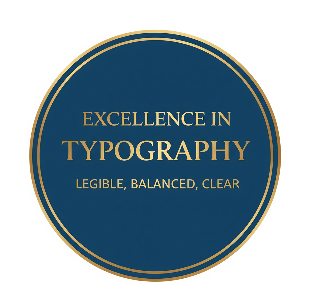
Stamp lettering has a hard life. It is printed small, pressed through ink that spreads, scanned, photocopied and shrunk into the corner of a PDF. A font that looks elegant on a large screen can turn into a gray smudge at real size. Typography is what decides whether people can still read the name, date or status after all of that.
This guide covers practical rules for round and rectangular stamps: hierarchy, font choice, weight, size, curved text, letter case and multilingual wording.
Before you pick a font, write out every word the stamp must carry and decide what people need to read first. On most seals that is the organization name. Secondary information, such as a city, department or registration number, comes next. Small details, such as a field label, come last.
Two or three levels are usually enough:
- Primary: the largest text, usually on the top arc of a round seal or the first line of a rectangular stamp.
- Secondary: smaller supporting text, often on the bottom arc or a second line.
- Tertiary: short labels or numbers, used sparingly.
If you need more levels than that, the stamp is probably carrying too much. Cut words first, because every word you remove lets the remaining text grow. When the lettering must carry the entire mark, the shows how to build hierarchy, spacing, and useful variants without relying on an icon.
Good stamp fonts share a few traits: even stroke thickness, open shapes inside letters such as a, e and s, and clear differences between similar characters such as 1, l and I, or 0 and O. That last point matters whenever a stamp includes a phone number, license number or date.
Sturdy sans-serif typefaces are a safe default. A serif face can work well for a traditional seal if its thin strokes are not too delicate. Avoid hairline serifs, very condensed or light weights, and decorative scripts for anything people must read. A script can work for a single short word in the center of a decorative stamp, but not for an address.
Limit the design to one or two typefaces and create hierarchy with size and weight. If you use a brand font, check that its license allows use in logos or artwork.
Regular to bold weights usually work best. Light weights break up in print and fade when a stamp is scaled down. Very heavy weights have the opposite problem: the small openings in letters fill in when ink spreads, especially on physical rubber stamps.
Balance the text against the border. Heavy lettering inside a thin ring looks unanchored, and thin lettering inside a thick double border looks weak. If you apply a distressed aging effect, choose a slightly heavier weight, because the texture breaks up thin strokes first.
There is no single minimum that fits every stamp, because the right size depends on the final dimensions and on how the stamp will be used. Test the design at its real size instead:
- Print it at 100 percent on plain office paper and read it at arm's length.
- Photocopy or scan that printout once and check the copy.
- Place the exported file in a PDF and view it at normal zoom.
If any line needs squinting, shorten the wording or increase the size. As a starting point, keep secondary text at roughly two-thirds of the main text size and adjust after testing. When the gap between levels is very large, the smallest line is the first to disappear on a copy. If you are ordering a physical stamp, ask the manufacturer whether they have a minimum text size.
Round seals usually place the main name on the top arc and secondary text on the bottom arc. On the top arc, the tops of the letters point outward. On the bottom arc, they point toward the center, so both lines read upright and left to right.
Spacing behaves differently on each arc. Letters on the top arc fan out at their tops, while letters on the bottom arc crowd together at their tops because those tops sit on a smaller circle. Bottom-arc text therefore often needs a little more letter spacing than the same text on top.
A few more habits keep round layouts tidy:
- Center each arc on the vertical axis so the stamp does not look rotated.
- Leave equal gaps where the top and bottom text meet, and use a small star or dot as a separator if the gaps look empty.
- Keep a consistent distance between the text and the rings. Text that touches a border reads as a blob in print.
- If a name has to run almost all the way around the circle, shorten it, reduce the size slightly, move part of it to the bottom arc, or consider an oval shape.
Rectangular stamps give text more room, but they need alignment discipline. Center short status words such as PAID or RECEIVED. Left-align multi-line content such as addresses, where readers scan from the start of each line.
Leave enough line spacing that letters from one line do not touch the next when ink spreads. If the stamp includes fields to fill in by hand, such as "Date" or "Checked by", keep the labels small and leave a writing line long enough for real handwriting. are a useful starting point for this kind of layout.
Uppercase letters share a common height, so they sit evenly on an arc and look formal. That makes capitals a natural fit for short names and status words. Long uppercase lines, however, take more width and are slower to read.
Mixed case suits addresses, long names, email addresses and web addresses, which people expect to see in lowercase. On curved text, watch descenders: letters such as g, p and y hang below the baseline, and on the bottom arc they point outward toward the ring, where they can touch the border.
Choose one case style per hierarchy level and apply it consistently.
When a stamp carries more than one language, start with the font. It must include every character you need, including accented letters and other scripts. Missing characters may appear as empty boxes or switch silently to a different font.
Accented capitals need extra room above the letter, especially on the top arc where the marks point toward the ring. Chinese, Japanese and Korean characters have dense strokes and usually need a larger size than Latin text of the same importance. For right-to-left scripts such as Arabic and Hebrew, check reading direction carefully on curved text. Avoid adding wide letter spacing to Arabic, whose letters are designed to join.
Give each language its own arc or line rather than interleaving them, and ask a native speaker to proofread the final artwork. For layout patterns, see these notes on .
In SealsDigital, curved and straight text elements each have controls for font, size, color, letter spacing and position. A sensible order is to set the primary text first, adjust its spacing until the arc looks even, then add secondary text and finally any center element. Check the preview at the size the stamp will actually appear, not only zoomed in. You can try these steps in for free before exporting anything.
Good stamp typography is mostly restraint: fewer words, sturdy fonts, consistent spacing and real-size testing. For related advice on layout and file preparation, browse our .
What kind of font works best on a round stamp?
A sturdy sans-serif or a serif with moderate stroke contrast usually works best. Look for even strokes, open letter shapes and clear numerals. Avoid hairline, condensed light and script fonts for text that must be read.
How do I keep curved text evenly spaced?
Adjust letter spacing separately for the top and bottom arcs, because bottom-arc letters crowd together at their tops. Center each arc on the vertical axis and leave equal gaps where the two lines meet. Check the result at real size, not just zoomed in.
Should stamp text be all caps?
Capitals work well for short names and status words, especially on curved text. Use mixed case for addresses, long names and email addresses, which are easier to read that way. Keep one style per hierarchy level.
How small can text be on a stamp?
It depends on the stamp's final size and how it will be reproduced. Print the design at 100 percent, photocopy it once and read both versions. If any line is hard to read, shorten the wording or enlarge the text.
