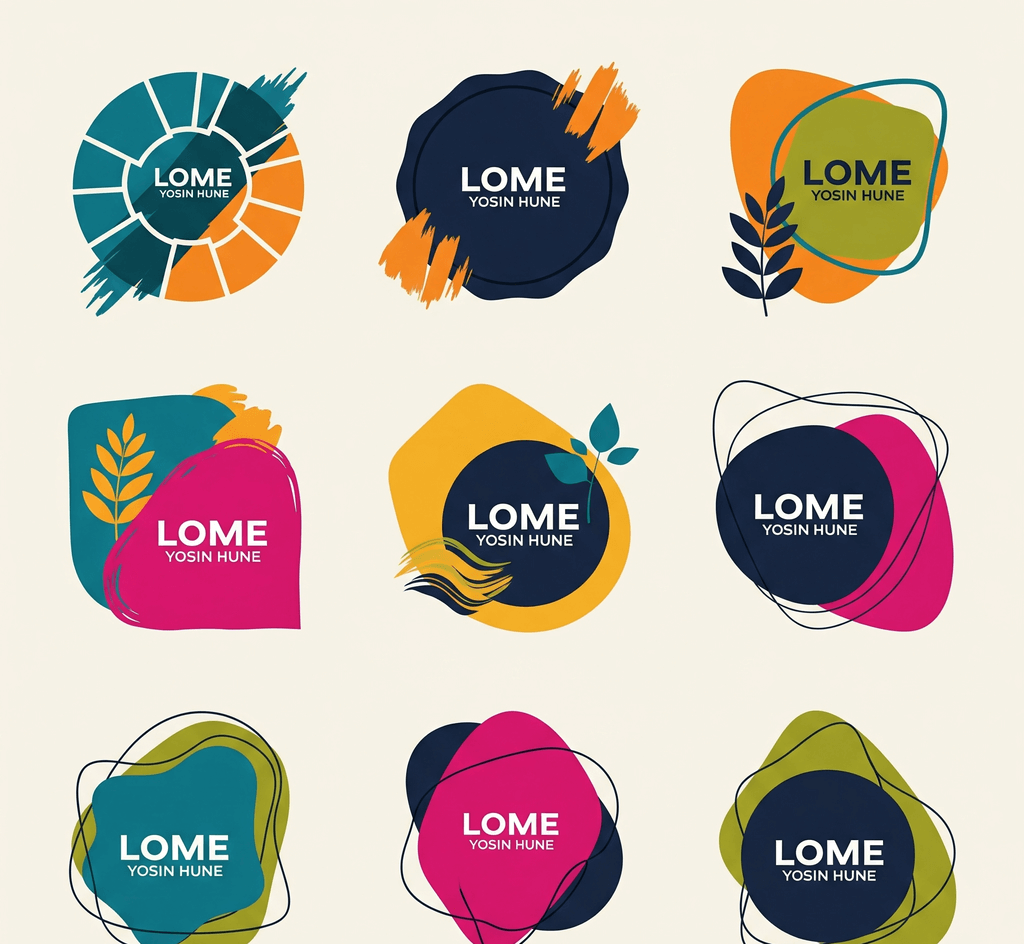
A small business stamp can do a lot with very little. One well-made mark can close a paper bag, sign off a thank-you card, track visits on a loyalty card, and decorate a wristband at a pop-up market. The catch is that creative stamps still have to work in ordinary conditions: inked by busy staff, pressed onto kraft paper or glossy card, photographed by customers, and reused for months.
The ideas below aim to be playful and practical at the same time. Each one comes with the constraints that decide whether it survives real use.
A few decisions keep creative stamps usable:
- One job per stamp. A stamp that tries to be logo, slogan, website and thank-you note at once ends up too small to read. Pick the single thing it must communicate.
- Design at real size. Measure the surface first: the flap of a mailer, a loyalty card box, the back of a hand. Many good ideas fail simply because they were designed large and then shrunk.
- Plan for one ink color. A physical rubber stamp prints one color per impression. Multi-color effects need separate stamps lined up by hand, which rarely stays neat during a rush.
- Expect uneven pressure. Bold shapes and moderate line weights tolerate imperfect inking. Hairlines and tiny counters (the enclosed spaces in letters such as "e" and "a") fill in first.
- Check the surface. Kraft paper absorbs ink and softens edges, coated card can smear, and dark packaging hides dark ink. Plan contrast for the actual material.
A round seal stamped across the fold of a paper bag or the edge of tissue paper does two jobs: it finishes the closure visually and marks the package as yours. A classic layout puts the business name in curved text around the top, a short line such as the town or founding year along the bottom, and a simple icon in the center.
Keep the icon bold and compact. A cup, a leaf, a needle and thread, or a single initial works better than a detailed illustration. If you already have a logo, a is a quick way to see how it holds up inside a circular frame. Simplify the logo to one color first; gradients and thin outlines rarely survive rubber or kraft paper.
Thank-you stamps are one of the simplest ways to make packaging feel personal without printing custom inserts. Short wording works best: "Thank you," "Made with care," or "Packed by hand in" followed by your town. A friendly script font can carry the main word, but pair it with a plain font for supporting text so the message stays readable.
Decide where the customer will see it first, whether that is the inside flap, an insert card, or the tissue, and design for that surface. For wording, placement and testing across mailers and cards, see this guide to .
Loyalty cards need a small, repeatable mark that staff can apply quickly and customers recognize. Creative options include an icon that matches your product, such as a coffee bean, scissors, a paw print or a slice of pizza, or a tiny version of your logo.
Constraints matter more here than anywhere else:
- The stamp must fit inside the card's boxes with a little margin, so measure a box and design slightly smaller.
- The design should be distinctive enough that a generic store-bought stamp cannot pass for it.
- Use one color and skip text the box cannot hold. Often the icon alone is enough.
Restaurants and cafes face extra pressure at the counter, so their programs need clear rules about when and how cards are stamped. The article on covers card layout and staff handoffs.
Markets, workshops and festivals give stamps a playful role:
- Re-entry hand stamps need a bold, simple shape, a day marker if the event runs several days, and ink sold for use on skin.
- Passport-style stamps for trails or market stalls can be collected on a card. Give each stall its own icon while keeping the same outline and size, so the set reads as a series.
- Workshop completion stamps on certificates or class cards can carry the workshop name and a space for the date.
Event stamps are temporary, so you can be bolder with themes and colors, but legibility rules still apply. A stamp checked at a door in low light has to be recognizable in a second.
Instead of designing a new stamp every season, keep a master layout and swap one element: a snowflake in winter, a leaf in autumn, a different ink color for a holiday sale. Customers see variety while the brand stays consistent.
Keep the outline, name position and type style fixed. Change only the center icon or the small secondary line, and start each variant from the same saved master. On SealsDigital, a free account lets you save designs to My Library and reopen them for the next season.
Distressed borders and aged-ink effects give a stamp a crafted feel that suits bakeries, coffee roasters and stationers. For digital artwork such as social images, labels or a website badge, an aging effect adds texture without a physical stamp.
Two cautions. If you are ordering a physical rubber stamp, leave the aging effect out of the artwork; real ink and paper already add texture, and doubling it makes text look damaged. And keep small text clear of distressed areas, because the texture removes parts of each letter.
Before you order stamps or print in volume:
- Print the design at actual size on plain paper and on your real packaging or card stock.
- Hold it at arm's length. The name or main message should read without effort.
- Photograph it with a phone in ordinary light, since customers will.
- Show it to someone who does not know the brand and ask what it says.
- For a physical stamp, ask your vendor for a proof and confirm size and ink color in writing.
You can sketch all of these ideas in an . Pick a circle, oval, rectangle or triangle outline, add curved and straight text, choose a single, double, dashed, dotted or vintage border, place shapes such as stars or lines, and upload a logo as SVG or PNG. Designing and previewing are free. When the design is ready, export a transparent PNG for digital use, or SVG and EPS files for a stamp manufacturer.
Creative small-business stamps work when the idea respects the constraints: one job, real size, one color, sturdy shapes, and a test on real materials. Start with one stamp that does its job well, then build variants from the same master. For more practical design ideas, explore the rest of our .
How small can text be on a creative stamp?
It depends on the font, the surface and how the stamp is made, so test at real size instead of relying on a single number. Bold, simple fonts can go smaller than thin or decorative ones. If you have to squint at a printed proof, make the text larger or use fewer words.
Can one stamp design work on both kraft paper and white cards?
Often, yes, if the design uses moderate line weights and a dark ink that contrasts with both. Kraft paper absorbs ink and blurs fine detail, so test there first. If the design fails on kraft, simplify it rather than maintaining separate versions.
Should I add an aging effect to my stamp design?
Use it for digital artwork where you want a hand-made look, and keep it light. Leave it out of artwork for a physical rubber stamp, because real ink already adds texture and extra distressing can make text hard to read.
Can customers copy my loyalty card stamp?
A determined person can copy almost any stamp. A distinctive custom icon makes casual copying harder than a generic store-bought stamp, and simple staff rules, such as initialing the card when it is redeemed, add another check. For most small loyalty programs, that level of control is enough.
