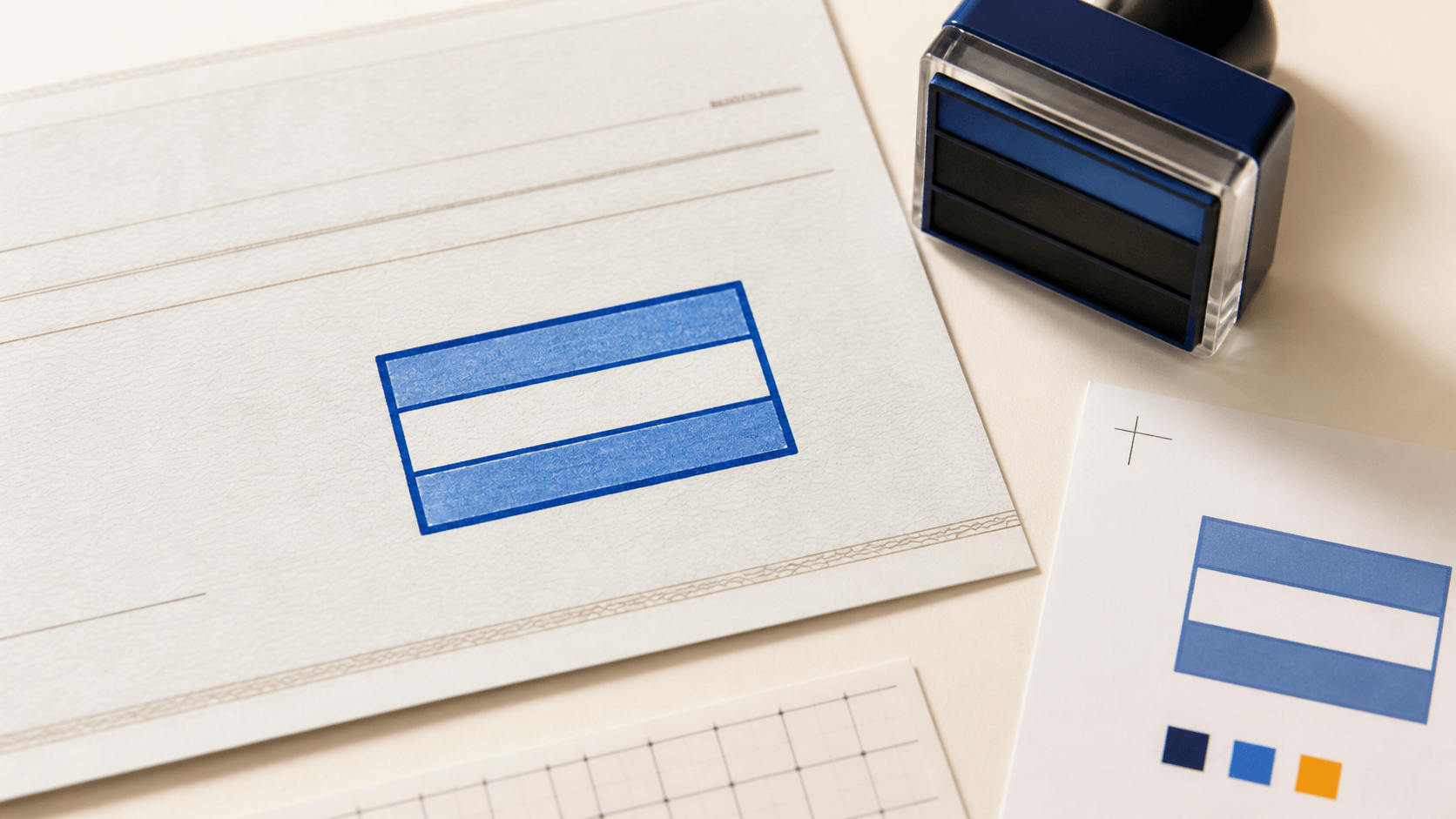
A deposit only stamp has a small canvas and a serious job: it must place the intended instruction, account reference, and identifying details where a reviewer can read them without hesitation. The temptation is to copy every useful field into one rectangle. That usually produces the opposite result. Long bank names shrink, account references compete with addresses, and the instruction that matters most becomes just another line.
The better starting point is hierarchy. Decide what someone must notice first, what they should verify second, and what information is merely supportive. Then design the mark around that reading order. This guide uses one of the site's as a visual reference and turns its three-part structure into a practical layout method.
This is design and workflow guidance, not a rule about how a particular financial institution will process an item. A generated stamp image does not prove authority, satisfy an institution's endorsement requirements, or guarantee acceptance. Confirm the exact wording and account details with the bank or credit union that serves the account before adopting a final version.
Write the core instruction in plain text before opening the editor. If “FOR DEPOSIT ONLY” is the phrase your institution has confirmed, it should receive the strongest visual emphasis. It can sit on one line in a wide mark or on two balanced lines in a narrower one. Either way, it needs enough space around it to be recognized as the primary message.
Do not make the bank name, branch address, business name, or account reference equally bold. When every line shouts, the reader has no entry point. A simple hierarchy is usually enough:
- restriction or action phrase;
- account or organization identifier;
- optional supporting reference.
That sequence also gives the designer a sensible failure rule. If the layout becomes crowded, remove or shorten a supporting detail before reducing the primary instruction. A clean three-line mark is more useful than a six-line mark that only looks complete at 200 percent zoom.
Collect candidate content in a short worksheet. Mark each item as required, helpful, or better stored elsewhere. This prevents the design review from turning into a debate about fields after the layout is already polished.
Possible fields include:
- the confirmed deposit instruction;
- the legal or operating name tied to the account;
- a masked or full account reference, if the institution requires and the organization permits it;
- an internal entity code for teams managing multiple accounts;
- a location code when several offices route deposits separately;
- a small version identifier for controlled templates.
A street address is often the first candidate to question. It consumes space quickly and may not help the person processing the item. The same applies to phone numbers, websites, slogans, and decorative taglines. If a field does not change the next action or help select the correct account, it probably belongs in a directory or procedure rather than in the impression.
Treat sensitive identifiers deliberately. Decide who may access the artwork, where the master file is stored, and whether a masked internal reference can serve the workflow. Do not add information simply because the template has room for another line.
The reference template suggests a useful structure: an instruction zone at the top, an identity zone in the middle, and a supporting zone at the bottom. These zones do not need visible dividers. Whitespace and typography can separate them more cleanly.
Give the instruction zone roughly the first third of the height. Use a sturdy, uncomplicated typeface and avoid extreme letter spacing. The middle zone can carry the bank or business identifier in a slightly smaller weight. The final zone should be the quietest; it can hold an account or location reference without pulling attention away from the instruction.
Keep all three zones aligned to the same visual axis. Center alignment suits short, symmetrical content. Left alignment works better when the organization name or reference is long. Mixing centered and left-aligned lines inside a tiny mark usually makes it look accidental unless the split is very deliberate.
Add breathing room at the perimeter. A border can organize the mark, but it should not squeeze the text. If removing the border makes the content immediately calmer, the layout was relying on the frame to solve a spacing problem. Restore the border only after the text block works on its own.
Account references contain repetitive characters, so the wrong font can create ambiguity. Choose a face in which zero, eight, three, five, and six remain distinct at the intended output size. Avoid condensed styles when a long number can be wrapped, grouped, or replaced by an approved internal code.
Use grouping only when it matches the organization's verified source record. Do not invent spaces or punctuation merely for appearance if that could change how staff copy the reference. A label such as “ACCT” or “ACCOUNT” can help separate the identifier from other numbers, but it should remain visually subordinate to the deposit instruction.
Test the longest valid organization name and reference, not the shortest sample. A template that works only for “ABC LLC” is not ready for a multi-entity finance team. If the longest combination fails, create an approved large-format variant rather than silently shrinking all text.
The screen is generous; the back of a check is not. Export a draft, place it at the intended dimensions, and print it at 100 percent scale. Do not use “fit to page,” because automatic scaling hides whether the real design works.
Review the proof in four conditions:
- a clean print on ordinary office paper;
- a grayscale scan;
- a photocopy of that scan;
- a print with slightly reduced contrast.
The goal is not to simulate every machine. It is to discover fragile details: thin borders that disappear, compressed letters that close up, and supporting lines that merge. Ask someone who did not create the artwork to read the proof in order. If they notice the account reference before the instruction, revise the hierarchy.
Also compare the footprint with the space available on the documents the team actually handles. The mark should avoid signatures, preprinted boxes, magnetic-code areas, and other document content. Placement rules belong in the operating procedure, not only in a designer's memory.
Finance teams often have several similar entities, locations, or accounts. That makes near-duplicate artwork risky. A file named deposit-final-new-2.png gives the user no reliable way to know which version is current.
Assign one owner to the template set and adopt a plain naming pattern. Include an entity code, an account alias that does not expose more information than necessary, and a version or effective date. Maintain a short register that records:
- approved wording;
- intended account or entity;
- artwork owner;
- date placed in service;
- retired version and retirement date;
- storage location for the master.
This visual control works best alongside wider . The design tells staff what they are holding; the register and procedure tell them whether it is the approved tool for that account.
When an account closes or details change, retire the old artwork immediately. Remove it from shared folders, browser bookmarks, and local downloads used by the operating team. A clear design cannot protect a workflow if obsolete copies remain easy to select.
The use note should be shorter than this article. It needs to answer the questions a staff member has while holding a document:
- Which entity and account is this stamp for?
- Who is permitted to use it?
- Where should the impression be placed?
- What details must be checked before use?
- What should happen if the document is incomplete or unusual?
- Who handles exceptions?
Use annotated examples rather than dense policy language. Show one correct placement, one crowded placement, and one case that should be escalated instead of stamped. If the procedure differs by location or item type, make that branch obvious.
The mark should not become a shortcut around review. It is the last visible expression of an already defined decision. If staff are unsure which account applies, the right response is to pause and verify, not to choose the stamp whose wording looks closest.
A useful review session is small and concrete. Bring the template owner, one regular user, and the person who receives or reconciles the next step. Put several realistic examples on the table: a normal item, a cramped endorsement area, a long entity name, an outdated form, and an item with unclear ownership.
For each example, ask:
- Can the user select the correct version without opening every file?
- Is the primary instruction visible at a glance?
- Can the account or entity reference be copied correctly?
- Does the placement leave other important information unobstructed?
- Is the exception path clear when the stamp should not be used?
Record wording or layout changes as decisions, not casual edits. If two groups need different fields, create named variants with explicit scopes. Avoid a single overloaded template that tries to satisfy every department.
Before release, confirm that:
- the financial institution has confirmed the required wording and details;
- the instruction is the first element a reader notices;
- supporting information is visibly secondary;
- identifiers are accurate and readable at actual size;
- sensitive information is handled according to internal policy;
- the longest organization name and reference fit without forced compression;
- print, scan, and copy proofs remain legible;
- placement guidance uses realistic examples;
- one owner controls changes and retirement;
- obsolete files are removed from everyday access;
- the final image is treated as artwork, not evidence of authority or acceptance.
Should a deposit only stamp include an account number?
That depends on the institution, account, and organization's security policy. Confirm the required content directly with the bank or credit union. If an identifier is permitted, make it readable and control access to the artwork.
Is a border necessary?
No. A border can keep the mark visually contained, but whitespace may produce a clearer result. Test both versions at the real output size and keep the border only if it improves recognition without crowding the text.
Can one template cover several accounts?
Only if the confirmed wording and operating procedure genuinely support that use. When different accounts require different identifiers, named and controlled variants are safer than a generic template that forces staff to add details from memory.
How large should the instruction text be?
There is no useful universal number because the output dimensions, typeface, printer, and wording all affect legibility. Make the instruction the dominant line, print at actual size, and adjust after reading physical and scanned proofs.
Does a digital deposit stamp guarantee that a check will be accepted?
No. It is visual artwork and does not establish authority or guarantee acceptance. Follow the institution's current instructions and the account holder's approved process.
A reliable deposit only stamp is not the one with the most information. It is the one that communicates the confirmed instruction, identifies the right account or entity, and survives ordinary handling without inviting guesses. Start with a content decision, build a three-zone hierarchy, and test it at real size before anyone depends on it.
If you want to compare other structured layouts after the content is approved, the existing provides related design and workflow examples. Keep the boundary clear throughout: the tool helps create a readable image, while the institution and your internal controls determine when that image is appropriate to use.
