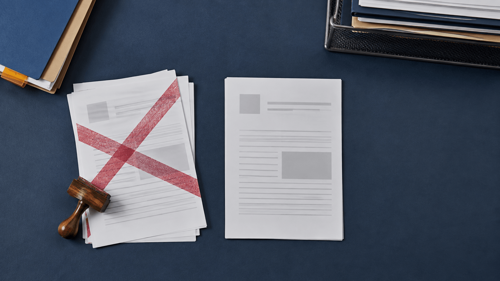
A sales coordinator replaces a quotation after correcting the quantity and delivery date. The new PDF goes into the shared folder, but the old version remains in an email thread and on a colleague's desk. Both pages look complete. A week later, someone opens the wrong copy and starts checking prices against terms that no longer apply.
A clear status mark can reduce that ambiguity. The difficult part is not drawing a large rectangle around the word VOID. It is deciding what the word means, when it should be applied, where it belongs, and what record must remain available afterward. If the design is dramatic but the operating rule is vague, the team still has two believable documents.
The practical work starts by treating VOID and CANCELLED stamps as document-control cues. That means distinguishing related states, building a readable mark, placing it without hiding evidence, and connecting it to a repeatable workflow. The visual stamp remains artwork. It does not delete a file, revoke an agreement, prove who acted, or determine a document's legal effect by itself.
Several negative-status words sound similar in conversation, but they can describe different events. Define the event first and use the narrowest accurate label.
VOID
VOID usually tells a reader not to treat that particular document or instrument as active. It is a strong visual word and should have a precise trigger. The team might use it for an unused form issued by mistake, a duplicate print that must not circulate, or a draft reference that should no longer be acted upon.
Do not let VOID silently mean “we changed our mind,” “there is a newer version,” “payment failed,” and “the customer cancelled.” Those situations may require different records and next steps. One word should not hide several business decisions.
CANCELLED
CANCELLED describes an action or request that has been stopped. It often benefits from a date, reference, or initials field because readers may need to understand when the cancellation occurred and where to find the underlying decision.
Be careful with tense and spelling. CANCELLED and CANCELED are both familiar in different English conventions. Pick the form used by the organization, document it, and keep every approved stamp consistent. A mixture looks like several unofficial versions even when the meaning is intended to be the same.
SUPERSEDED
SUPERSEDED is often clearer when the old document remains in the record but a newer version has replaced it. The word answers a useful question: this copy is historical, but it is no longer the current instruction. A short replacement reference can point the reader to the current version.
REJECTED and DUPLICATE
REJECTED normally indicates a review outcome, while DUPLICATE identifies a copy. Neither automatically means the page should be ignored forever. A rejected submission may need correction and resubmission. A duplicate may still be useful as a working copy. Keep those ideas separate from VOID unless the process explicitly joins them.
When the reproduction itself needs a clear role, use the to distinguish working, controlled, and reference copies without confusing those labels with lifecycle status.
Before opening a stamp maker, complete one sentence: “Apply this mark when…” If three people finish the sentence differently, the team is not ready to design.
A workable rule names the event, actor, and next action. For example: “The document owner applies SUPERSEDED after the replacement is approved, then records the replacement ID in the field.” That sentence is more operational than “Use this on old documents.” It tells people when the state begins and how the chain continues.
Also write the counter-rule: “Do not apply this mark when…” A CANCELLED stamp may be wrong for an expired quote, a rejected application, or a draft that was never issued. Negative examples protect the vocabulary from expanding until every unwanted page receives the same label.
If you need to compare short wording arrangements, start with a . Test the exact approved word rather than a placeholder because width, letter density, and visual weight change from one status to another.
The status is the first reading task. Give it most of the visual weight. A compact reference or date can support the decision, but it should not compete with the word that changes how the page is handled.
Use a direct typeface with open letterforms. Condensed lettering may help a long word fit, yet excessive compression can make CANCELLED look like a dark bar after printing or scanning. Increase the overall width before squeezing letters together. If the physical space cannot grow, consider a shorter approved term rather than weakening the text.
Borders should contain the message, not make it look ceremonial. A single rectangle works for many office statuses because it creates a stable footprint. A double border can become heavy, especially when the word already uses bold capitals. Broken or distressed edges may suit a visual brand mark, but a control status benefits from clean edges that reproduce consistently.
Color is a secondary cue. Red may attract attention, but the mark must remain understandable in grayscale, on a low-ink print, and to a reader who does not share the team's color convention. The word carries the state. Color only reinforces it.
An obsolete document can still contain information that explains what happened. Do not cover the document number, version, date, amount, author, recipient, or existing approval trail merely to make the status prominent.
Map protected zones before choosing a placement. On a quotation, those may include the customer name, quote number, total, expiry date, and page count. On a request form, protect the requester, request ID, description, and existing decision fields. On a multi-page file, decide whether the mark belongs on every page or only on a controlled cover. The answer depends on how pages are separated and reused.
A diagonal mark across the center can be noticeable, but it is not automatically the best choice. If it crosses dense tables, signatures, or handwritten reasons, move it to a clear band near the top or bottom. If the page has no reliable open area, use a controlled cover sheet or a margin annotation linked to the record rather than obscuring the source.
Keep the footprint consistent. Staff should not rotate, stretch, or crop the stamp until it fits a random gap. Prepare one or two approved sizes and specify where each is used. Consistency helps readers recognize the state and makes poor placement easier to spot during review.
The main word may be enough for a low-risk internal copy. A formal workflow often needs one or two supporting fields. Common options include:
- date applied;
- staff initials or role code;
- document or case reference;
- replacement version;
- short reason code.
Every field creates work. If nobody checks it, remove it. If the field is routinely too small for handwriting, enlarge it or move the detail into the primary record. A stamp should not become a miniature form that staff cannot complete under normal desk conditions.
Avoid placing sensitive explanations in the impression. A reason such as “customer request,” “duplicate issue,” or an approved short code may be enough. Personal, financial, medical, or disciplinary details should remain in the system or record designed to control that information.
Define blanks as invalid when a field is required. A procedure can say that CANCELLED is incomplete until the date and reference are filled. That is clearer than hoping every operator guesses which blanks matter.
A digital status stamp and a physical rubber stamp can share the same wording, but their risks differ. A digital file can be copied into folders, attached to email, resized, or inserted by anyone who obtains it. A physical tool can be left at a shared desk, used with inconsistent ink, or carried to another work area.
For digital assets, store the approved file in a controlled location. Use a clear filename such as cancelled-status-v2.png, keep the editable master separate, and retire old exports when wording or layout changes. Limit edit rights even if broader staff need placement access. A flattened working copy is easier to use without accidental design changes, but it still needs an owner.
For physical tools, assign storage, inspection, and replacement responsibilities. Check that the impression remains complete and that required fields are legible. A damaged CANCELLED impression that loses its first letters can create a different problem from the one it was meant to solve.
Neither version authenticates the operator on its own. If the process needs evidence of who made a decision or whether a file changed afterward, use the organization's approved record, permissions, logs, or signing method. A visual stamp can point to that process; it should not be described as the process itself.
Marking a document VOID does not answer whether it should be deleted, archived, returned, or retained. Those actions depend on the document type, business need, applicable policy, recipient requirements, and local rules. Establish the retention decision outside the graphic.
When an old copy must remain, preserve enough context to connect it to the replacement. The pair might share a request ID, quote number, order number, or controlled version label. Do not write a full new set of terms on the voided page. A compact replacement reference is safer than turning the mark into an unofficial revision record.
The broader provides a useful framework for finding obsolete assets and retiring them deliberately. Apply the same discipline throughout the year: one owner approves the stamp, one location holds the current files, and an explicit action removes the old version from daily use.
A clean sample page is too easy. Build a small test set from realistic but fictional or redacted documents:
- a crowded invoice with little open space;
- a two-page quote whose pages may be separated;
- a grayscale scan with reduced contrast;
- a duplicate print with handwritten notes;
- an old version that must remain available for reference.
Ask reviewers to answer three questions without extra explanation: What is the document's status? What should I do next? Where can I find the current record? If the visual mark answers the first question but not the other two, improve the workflow or supporting reference rather than adding decoration.
Test both the original and the final delivery format. A digital overlay that looks correct in an editor may move, crop, or soften during export. A physical impression may look strong on copier paper and fail on coated stock. Review the actual route the document follows.
Before approving the mark, confirm that:
- VOID, CANCELLED, SUPERSEDED, REJECTED, and DUPLICATE have separate definitions;
- the main word remains clear at actual size and in grayscale;
- the mark avoids names, totals, signatures, references, and other evidence;
- required date, initials, or replacement fields are large enough to use;
- one owner controls the approved artwork or physical device;
- staff know when not to apply the mark;
- the document's retention and replacement actions are written elsewhere;
- digital exports are named and stored consistently;
- physical impressions are checked for damage and incomplete transfer;
- the marked sample is tested through the real scan, print, or PDF route.
More related design and control ideas are available in the . Use them to refine the asset, while keeping the status rule specific to the document process in front of you.
Is VOID the same as CANCELLED?
Not necessarily. VOID usually warns that a particular document or copy should not be treated as active. CANCELLED usually describes an action or request that was stopped. Define both terms for your workflow instead of relying on casual interpretation.
Should a void stamp cover the whole page?
It should be prominent without hiding information needed to identify, understand, or audit the document. On crowded pages, a clear header, footer, margin, or controlled cover sheet may work better than a diagonal mark through the center.
Does a VOID image invalidate a contract or payment document?
A visual mark alone should not be assumed to determine legal effect. The document, action, authority, recipient, jurisdiction, and supporting records all matter. Follow the applicable process and obtain qualified local guidance for formal uses.
Should every page receive the status stamp?
That depends on whether pages can become separated and mistaken for active copies. Define a page rule for each document type. If every page is marked, protect page numbers, references, and essential content.
Can color distinguish VOID from CANCELLED?
Color can help, but it should not carry the whole distinction. Use different words and, if useful, different border or field structures so the meaning survives grayscale copying and inconsistent displays.
A useful VOID or CANCELLED stamp starts with a defined event. Choose one accurate word, make it visually dominant, protect the information around it, and include only the fields that connect the page to its record. Then control who can apply the mark and what must happen afterward.
The stamp is a visible cue, not deletion, authentication, or a universal legal action. When the wording, placement, record reference, and retirement procedure agree, readers can recognize an inactive document without losing the history that explains it.
