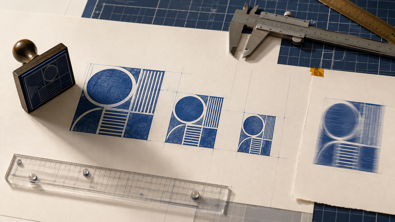
An approved stamp looks sharp in its original download. Then someone drags a corner to make it fit an invoice, another person copies that smaller version into a presentation, and a third enlarges the presentation image for a poster. By the end of the chain, the border is soft, the letters are uneven, and the circle has become a slight oval.
The problem is not simply that the stamp was resized. The team lost track of the master, changed dimensions without a destination, and reused derivatives as new sources. A reliable resizing workflow starts from the strongest file, preserves the design's geometry, and creates a fresh export for each real use.
The resizing method below starts with diagnosis, then moves through source choice, proportions, margins, line weight, and a small set of named exports that people can use without improvising.
“Low quality” can describe several different problems. Identify the visible symptom first.
The whole stamp looks soft
This usually means a small raster image was enlarged or repeatedly resampled. The pixel grid that described the original cannot reveal detail that was never captured. Sharpening may increase edge contrast, but it cannot restore accurate letter shapes or missing gaps.
The stamp is sharp but stretched
The width and height were changed independently. A round mark becomes oval, a square becomes rectangular, and lettering changes proportion with the frame. This is an aspect-ratio problem, not a resolution problem.
The border is clear but the text is crowded
The image may be technically sharp while the design is too detailed for the new physical size. Reducing a complete layout also reduces letter height, gaps, and open counters. The solution may be a simplified small-size variant rather than a higher-resolution export.
The stamp is clipped or surrounded by too much space
The canvas bounds are wrong. A tight crop can cut the border after placement. A huge invisible canvas can make the artwork appear tiny in document software. Resize the artwork and its canvas deliberately instead of treating them as the same thing.
Name the symptom in the correction note. That makes the next decision specific: return to a vector, restore proportions, simplify a small variant, or repair the canvas.
Search for the editable design before touching the blurry file. Good candidates include an SVG, an EPS, a vector PDF prepared as artwork, or the source project used to build the stamp. These can preserve curves, shapes, and text in a form that is not tied to one small pixel grid.
A PNG is a raster image. It can be an excellent daily-use file and may include transparency, but it has fixed pixel dimensions. A JPG is also raster and does not preserve transparency. Screenshots, pasted previews, and images extracted from chat messages are usually poor masters because their dimensions and compression history may be unclear.
The provides broader context for choosing among common outputs. For resizing, the practical rule is simple: return to editable vector geometry when possible, and use the largest clean approved raster only when a vector master is unavailable.
Do not quietly rebuild text from memory. If the source is missing, confirm the exact wording, type treatment, shape, and owner before reconstructing the asset.
Resizing to “medium” or “a bit smaller” produces files with no stable meaning. Describe the destination:
- invoice approval block;
- presentation footer;
- packaging card;
- email attachment preview;
- print-production reference;
- small internal status field.
Measure the available area in the destination. Note the intended displayed width and height, the surrounding content, and whether the file will be printed. A 600-pixel image does not have one universal real-world size; placement software and output settings influence how it appears.
Use a non-sensitive sample document with the same structure as the real one. Check the smallest normal destination first. If the stamp is readable there, a larger export may be easy. If the content collapses at the small size, more pixels alone will not solve the layout.
A neutral is useful for testing because you can compare different content densities without relying on an industry-specific mark.
Record the master ratio. A square or circular stamp normally sits in a square canvas. A horizontal status stamp may use a wider rectangle. Preserve that relationship whenever the same design is scaled.
Resize from a corner with aspect ratio locked, or enter one dimension and allow the other to update automatically. Afterward, check the frame with a simple geometric reference. A circular border should remain circular. Parallel sides should stay parallel. Letterforms should not appear unusually narrow or wide.
Do not stretch a stamp to fill a document box. If the available box has a different shape, leave controlled empty space, change the placement area, or design an approved companion layout. Distortion weakens recognition and makes later comparisons difficult.
Canvas padding also needs proportion. Keep a small, even transparent margin around the outer element. Do not scale a large empty canvas with the mark buried inside it. Trim first, inspect, then resize the prepared asset.
With a vector master, scale the complete group rather than individual parts. Borders, text, separators, icons, and texture should move together unless you are intentionally creating a new small-size design.
Before export, inspect effects that may not scale as expected. Stroke behavior, corner rounding, shadows, masks, and raster textures can respond differently from simple paths. Expand or adjust only when the destination requires it, and keep the original editable master unchanged.
At the target size, examine the smallest gaps and letter counters. Vector geometry can remain mathematically sharp while becoming visually too fine to reproduce or read. If the small result is too dense, create a controlled simplified version:
- remove a secondary line;
- shorten approved wording;
- reduce decorative separators;
- use one border instead of two;
- enlarge the primary status relative to supporting content.
Label the simplified file as a variant, not a generic replacement. The large master may still be appropriate elsewhere.
When PNG is the best source available, begin with the largest clean approved version. Duplicate it and keep the source untouched. Crop excess transparent space, correct any known edge halo, and resize directly to the required output dimensions.
Avoid a chain of incremental changes. Reducing from large to medium, saving, reducing medium to small, and then enlarging small to a new size compounds uncertainty. Each derivative should come from the same approved source.
Inspect the result at normal viewing size and at close zoom. Normal size reveals real readability. Close zoom reveals broken edges, uneven transparency, and resampling artifacts. Both views matter, but do not judge the whole design only by how individual pixels look when magnified.
If the raster source is already smaller than the intended destination, locate a better source or rebuild the artwork. Enlargement may be acceptable for a rough internal preview, but mark it clearly so it cannot be mistaken for a release asset.
Scaling changes more than overall dimensions. It changes how elements relate at the destination.
A double border that feels refined at a large size may merge into one heavy ring when reduced. A distressed texture may break small letters. A thin divider may disappear beside bold type. Tight tracking becomes harder to read when the mark is placed over document content.
Make decisions in this order:
- Preserve the primary message.
- Protect letter counters and spaces.
- Keep enough separation between text and border.
- Simplify secondary decoration.
- Retest the complete silhouette.
Do not solve every problem by thickening everything. Heavy text beside a heavy border creates a dark block. Adjust hierarchy: one element should lead, and supporting elements should remain clearly secondary.
A file can look correct in an image viewer and behave differently after insertion into a document. Test it through the actual path the user will follow.
Insert the export from file rather than copying it from a preview. Set its displayed size without unlocking proportions. Place it near realistic text and form fields. Save or export the document, reopen the result, and compare the edges and dimensions.
When printing is part of the workflow, print a sample at the intended page scale. Do not assume a large on-screen preview represents the final size. If scanning or photocopying is expected, test one sample through that path as well and note any details that weaken.
Verify the destination you actually control. Trying to certify the stamp in every possible application would add work without answering the immediate question.
Most teams do not need dozens of exports. They need a few dependable choices.
Create variants named by destination or actual dimension, such as invoice, presentation, and small-status, or by an approved width when that is more useful. Include the format and revision in the file name. Keep one README or release note that explains where each variant belongs.
Do not call a file small if it will later be used by several teams with different meanings. Destination names prevent people from selecting by appearance alone. Retire replaced variants so search results do not keep surfacing an obsolete file.
The contains additional design and workflow guidance. Use those resources to improve the master, then return to a controlled size set rather than allowing ad hoc copies to spread.
Before releasing any resized stamp, confirm:
- the source is approved and identifiable;
- the aspect ratio is unchanged;
- the intended display or print size is recorded;
- the border and smallest text remain distinct;
- the transparent margin is even and unclipped;
- the file was exported from the master, not another derivative;
- the receiving application was tested;
- simplified versions are labeled as variants;
- obsolete copies are outside the daily-use folder.
If one item is unknown, resolve it before making more sizes. A fast export from an uncertain source only multiplies the uncertainty.
Why does my digital stamp look blurry after enlargement?
The source is probably a raster image with fewer pixels than the new display requires, or it has already passed through resizing and compression. Return to a vector master or the largest clean approved raster rather than sharpening a small derivative repeatedly.
Is SVG always better for resizing?
SVG is valuable for scalable geometry, but the receiving application and the contents of the SVG still matter. A transparent PNG may be easier for routine placement. Keep vector artwork as the master and export the format required by the destination.
Can I make a round stamp wider to fit a box?
No. Changing width independently turns the circle into an oval and distorts the lettering. Preserve proportions and change the placement area, or create an approved rectangular companion design.
Should I use one large PNG everywhere?
One large approved PNG can be a useful source, but daily users benefit from destination-specific exports that are tested and clearly named. This reduces accidental stretching, oversized files, and reuse of previews.
When does a smaller stamp need a separate layout?
Create a small-size variant when the original wording, border system, or texture no longer remains clear at the required dimensions. Simplify secondary content while preserving the intended meaning and approval process.
Clean resizing is a source-control habit. Start with the strongest approved master, define the real destination, lock proportions, and export once for that use. Then test the file where it will actually appear.
If the design becomes crowded, create a deliberate small variant instead of demanding that extra pixels rescue an overloaded layout. A short, named set of reliable exports will protect quality better than a folder full of mystery sizes.
