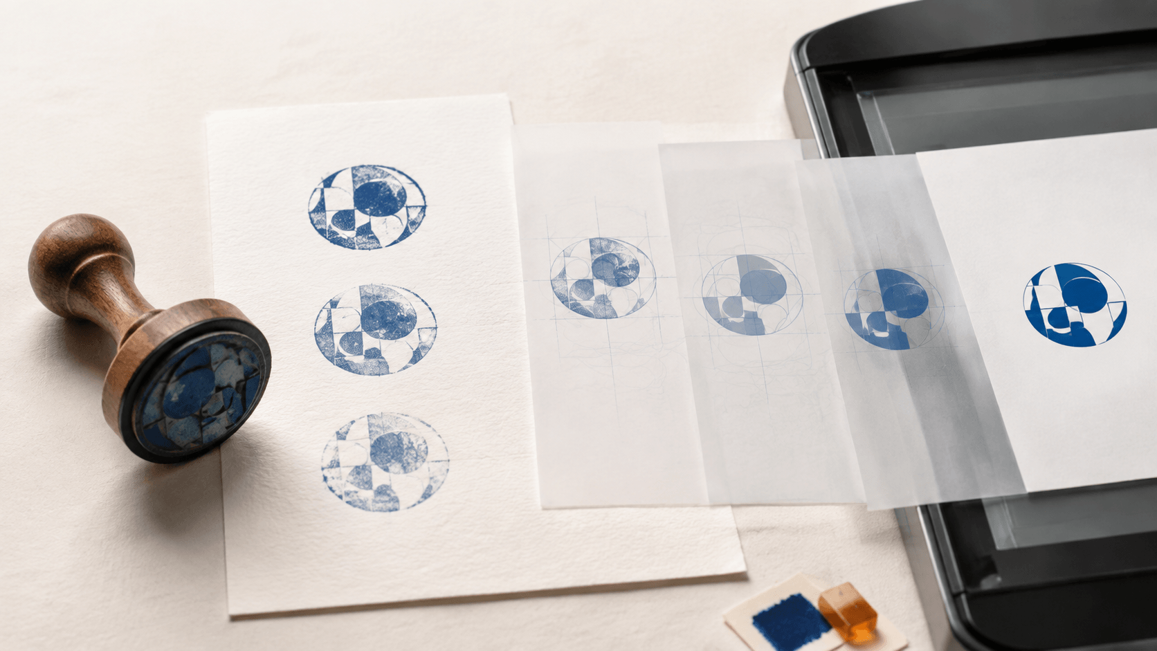
The only usable copy of an old business stamp is sitting in a desk drawer. Its rubber face is dusty, the handle has no design file attached to it, and every impression looks slightly different. One is light on the left. Another has a heavy ring. A third is clear except for a broken letter. You need a digital version for routine documents, but tracing the first impression you see would preserve every accidental flaw.
A better process treats the physical stamp as reference material. You create several controlled impressions, choose the strongest evidence, decide which texture belongs to the design, and rebuild only what the intended mark requires. The result can retain the character of an inked stamp without looking like a cropped photograph.
The steps below cover that practical conversion. They apply to marks you own or are authorized to reproduce. Turning a mark into an image does not prove identity, official status, consent, or legal validity. If a stamp is regulated, licensed, or controlled by an organization, confirm the applicable rules and obtain permission before copying it.
Do not begin with cleanup tools. Begin with the destination.
A stamp used as a small status mark on an internal PDF needs strong lettering, a compact canvas, and clean transparency. A decorative mark used on packaging may keep more texture. A reference image sent to a stamp manufacturer may need precise geometry and actual dimensions. These are different assets even when they originate from the same physical tool.
Write down four decisions:
- where the digital stamp will appear;
- the smallest size at which it must remain readable;
- whether the aged ink texture is intentional or accidental;
- who may use and approve the finished file.
That short brief prevents over-restoration. If the purpose is archival documentation, preserve the physical impression honestly. If the purpose is daily document placement, remove paper color, dust, skew, and incomplete ink that do not belong to the underlying design.
The comparison between a is useful at this stage because the visual design may travel between media while the operating method changes. Decide which medium you are preparing before judging the source.
One weak impression is not enough evidence. Make a fresh reference sheet whenever the original tool is available and you are permitted to use it.
Clean the stamp without damaging it
Remove loose dust and dried surface ink using a method appropriate for the stamp material and ink. Avoid aggressive solvents or scraping when you do not know how the rubber, polymer, mount, or adhesive will react. Concentrate on keeping removable debris out of the digital artwork; a cosmetic restoration is unnecessary.
Inspect the face under even light. Look for cuts, compressed areas, detached pieces, and residue between small letters. Record visible damage before making impressions. This helps you distinguish a worn physical defect from an intentional break in the design.
Make several controlled impressions
Use clean, untextured paper and an ink pad that produces clear edges. Press the stamp straight down with even contact. Do not rock it to fill a missing area; rocking can widen the border and duplicate edges. Make several impressions with small adjustments to pressure and ink load.
Label the sheet outside the capture area with the date, stamp owner, and test purpose. Keep the labels away from the mark itself so they cannot be mistaken for part of the design.
If the original stamp is unavailable but you have old documents, collect several authorized examples. Choose pages without confidential information, signatures, account numbers, or unrelated personal data. Crop only after you have identified the strongest source.
A flatbed scanner usually gives an even, square view. A camera can also work when the paper is flat, the lens is parallel to it, and the light is diffuse. In either case, leave generous blank paper around the stamp during capture. Tight cropping makes it harder to correct rotation and identify the real edge.
Avoid automatic document filters that force the page into pure black and white before you inspect it. They may close small counters, join nearby lines, or remove light but legitimate details. Keep an untouched capture and make edits on a duplicate.
Check four things at full view and close zoom:
- The circular or rectangular frame is not distorted by perspective.
- Fine spaces inside letters remain visible.
- No shadow crosses the impression.
- Paper texture is separate from ink texture.
If these conditions are not met, recapture. Ten careful minutes at the source can save a long repair session later.
The darkest sample may have filled-in letters and an oversized border. The cleanest source is the one that shows the intended geometry most completely.
Compare samples side by side. Look for consistent letter shapes, ring thickness, separator positions, and alignment. A gap that appears in every impression may belong to a damaged stamp face. A gap that appears once is probably an inking or pressure defect. Use repeated evidence rather than guessing.
You can combine reference information without building a dishonest composite. For example, one impression may show the left side of the border clearly while another confirms the shape of a letter on the right. Reconstruct the intended design from those observations, then review the result as a fresh asset. Do not paste unrelated fragments together and call the result an untouched scan.
For a neutral comparison of typical stamp geometry, a can help you inspect borders, spacing, and center balance. It should not replace the authorized wording or identity in your source.
Cleanup preserves the captured impression. Reconstruction redraws the intended mark. The right choice depends on use.
Use cleanup when the irregular ink edge is part of the desired character, the lettering is complete, and the digital file will appear at a similar size. Remove the paper background, isolated dust, accidental shadows, and obvious capture artifacts. Keep natural edge variation rather than smoothing every mark into plastic perfection.
Reconstruct when letters are broken, the border is deformed, the only source is very small, or the asset needs to scale across several destinations. Build the frame as clean geometry and set the wording from an approved text source. Recreate simple separators or icons only when their intended shapes are clear.
Do not invent missing text. If a word cannot be read confidently, stop and find an authoritative record. A polished guess is more dangerous than a visibly incomplete draft because it looks ready for use.
Work from large corrections to small ones.
First, straighten the source using the border or baseline. Correct perspective only when the capture introduced it. Next, separate the ink from the paper while watching the lightest legitimate strokes. Then remove isolated specks outside the design. Finally, crop the canvas with a small, even margin.
Do not erase every dot inside the impression. Some dots are part of the ink texture that makes the mark recognizable. Zoom back to intended size after each cleanup pass. A defect that looks dramatic at extreme zoom may be invisible in use, while an erased gap can make a letter look unnaturally thin.
Keep the cleaned monochrome artwork on its own layer. Place temporary white, gray, and dark backgrounds beneath it during inspection. These layers are tests, not part of the final transparent file.
When reconstruction is necessary, separate structural elements:
- outer and inner borders;
- top and bottom text;
- center symbol or monogram;
- separators;
- intentional distressed texture.
Start with the border because it establishes the center and available area. Add approved wording as editable text, then compare letter height, width, and spacing with the strongest impressions. If the original typeface is unknown, choose a close, readable substitute and document that it is a reconstruction.
Texture should be added last. A small amount of controlled wear can echo the physical source. Randomly deleting large pieces of letters makes the asset harder to read and harder to reproduce. Keep a clean master before applying any texture so future versions do not require another trace.
PNG is a raster format that can store an alpha channel, allowing background content to show through transparent pixels. That makes it practical for placing a digital stamp on documents. Transparency does not mean making the ink itself faint. The stamp shape should remain deliberate while the empty canvas disappears.
Inspect the edges against several colors. A pale fringe often comes from leaving partially visible paper pixels around the ink. Remove the fringe carefully without cutting into curves or small counters. If one receiving application still adds a box, test the file in another viewer before editing the master again; the placement workflow may be adding its own background.
Keep a solid-background preview for quick review, but label it clearly so users do not place it over colored content by mistake.
Open the stamp at its intended size, not only at high zoom. Place it on a clean sample of the actual document type. Check nearby text, form fields, page edges, and other visual marks. The stamp should be readable without covering information needed by the recipient.
Run a simple comparison:
- cleaned digital asset beside the best physical impression;
- light and dark document backgrounds;
- normal viewing size and a modest reduction;
- screen view and a printed sample when printing is part of the workflow.
Ask an authorized reviewer to compare the exact wording and identify the source used for approval. Record the date and version. Approval should describe the artwork, not imply that every future use of the file is automatically authorized.
Keep the untouched capture, cleaned master, editable reconstruction if one exists, approved transparent export, and review proof in separate folders. Use names that describe status and purpose rather than vague labels such as new-final-2.
Daily users should receive only the approved copy needed for their task. Limit access when the mark communicates a sensitive status. A visual stamp file can be copied easily; folder structure and ownership matter as much as the graphic.
The broader can help when you need to rebuild a layout instead of preserving the scanned texture. Keep the capture as evidence of the source and treat the rebuilt design as a new controlled version.
Can I digitize any stamp I find?
No. Use only a stamp you own or have permission to reproduce. Official, licensed, organizational, and signature-related marks may have additional restrictions. Check the owner and applicable requirements before copying or distributing the image.
Should a digital stamp look perfectly smooth?
Not always. A clean office mark may benefit from precise edges, while a decorative brand stamp may intentionally retain restrained ink texture. Preserve character only when it supports the intended use and does not damage legibility.
Is a phone photo enough?
It can be, provided the paper is flat, the camera is parallel, the lighting is even, and the captured detail is sufficient. A scanner often makes alignment and lighting easier, but the quality of the source matters more than the device label.
Should I clean one impression or combine several?
Compare several impressions whenever possible. Use them to understand the intended shapes, but be transparent about reconstruction. Do not hide guessed text or present a composite as an untouched original.
Does a digital copy have the same authority as the physical stamp?
Not automatically. A visual image does not by itself prove who applied it, whether the user had authority, or whether the document changed. Acceptance and legal requirements depend on the organization, workflow, and jurisdiction.
Turning a physical stamp into a digital stamp is a small restoration project. Define the destination, make several careful impressions, preserve an untouched capture, and separate intentional character from accidental damage. Clean what the source supports and rebuild only what an authorized record confirms.
The best result is not the darkest scan or the smoothest trace. It is a controlled asset whose wording is correct, edges are usable, purpose is documented, and relationship to the physical source is clear.
