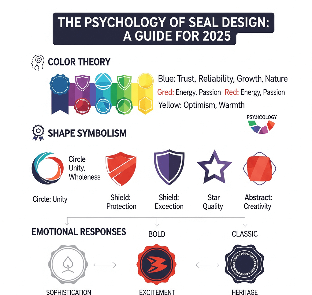
Two stamps can carry the same words and still give completely different impressions. One looks like it belongs on a certificate; the other looks like it belongs on a gift bag. The difference comes from design choices: the outline, the border, the typeface, the color, and how much space is left empty.
This guide is not about hidden psychological triggers. It is about visual conventions. People have seen countless stamps, seals, labels, and badges, and they read new designs by comparing them with what they already know. If you understand those conventions, you can decide deliberately how formal or how friendly your seal should look, and avoid sending the wrong signal by accident.
Think about the stamps and seals people encounter regularly: a notary seal, a university emblem on a diploma, a RECEIVED mark on an invoice, a coffee shop loyalty card, a craft brand's logo on a paper bag. Each category has a recognizable look. Official seals tend to be round, dense, symmetrical, and printed in one dark ink. Friendly brand stamps tend to be looser, with more space, softer type, and sometimes a hand-made texture.
When you borrow cues from one category, people tend to read your stamp as belonging to it. That is useful when you want a business seal to feel established. It also creates a responsibility: a design that borrows too heavily from government or institutional seals can mislead people into thinking a document carries authority it does not have. Aim for the right tone, not imitation.
The outline is the first thing people notice, often before they read a single word.
- Circle. The traditional seal shape. A round stamp with text curved around the edge reads as formal and institutional, especially with a centered emblem.
- Oval. Similar to a circle but softer. Ovals often carry company names and can feel formal without looking like an official emblem.
- Rectangle. The shape of office status stamps such as RECEIVED, PAID, or APPROVED. Rectangles read as administrative and practical, a mark that something has been processed.
- Triangle. Unusual for official use, so it draws attention. It can work for warning or attention marks and for playful brand stamps.
In the you can switch between circle, oval, rectangle, and triangle outlines while keeping the same text, which is a quick way to see how much the shape alone changes the tone.
Borders frame the content, but they also communicate how serious the stamp is.
- Double and triple borders add structure and weight. They are common on formal seals and tend to make a design feel more official.
- A single thin border looks clean and modern. It suits contemporary brands and internal stamps that should not look heavy.
- Dashed and dotted borders feel informal. They suggest coupons, crafts, tickets, and loyalty cards.
- Vintage borders suggest heritage or a handmade product. They can add character but also make a business document look like a prop if overused.
A border should support the text, not compete with it. A heavy triple ring around small lettering can overwhelm the message. For more on choosing frames, see this guide to .
Type often does more to set the mood than any other element.
- All capitals with even spacing read as formal and authoritative. This is the standard look for seals and status stamps.
- Serif typefaces suggest tradition and permanence. They suit established firms, institutions, and certificates.
- Clean sans-serif typefaces look modern and neutral. They are easy to read at small sizes and on screens.
- Script and handwritten styles feel personal and friendly. They suit wedding stamps, thank-you notes, and small-brand packaging, but they become hard to read when small or curved.
Letter spacing matters as much as the typeface. Tight, crowded text looks hurried; generous, even spacing looks considered. On curved text, check that letters do not collide at the top of the arc or drift apart at the bottom. The guide to covers font choices in more detail.
You will see many claims that a particular color "means" trust or energy. In practice, color meaning depends heavily on context and culture, so it is better to think in terms of where a color is commonly used.
- Black and dark blue are the ordinary office ink colors. They read as neutral and businesslike, and they copy and scan reliably.
- Red draws attention. Offices often use it for URGENT, PAID, or VOID marks. Red also has a long tradition in East Asian seals, where red seal paste is the norm, so in some contexts it reads as formal rather than alarming.
- Green, purple, and brand colors look more personal and less official. They suit marketing, packaging, and internal team stamps.
Most stamps use one ink color, and that restraint is part of why they look like stamps. Several colors in one design tend to make it read as a sticker or logo instead. If you choose a light color, check that it still shows up on a black-and-white photocopy.
A seal packed with text, stars, and rings looks busy and formal, sometimes bureaucratic. A design with fewer elements and more open space looks modern and approachable. Neither is better in general; what matters is whether the result matches the job and stays readable at actual size.
Texture affects tone too. A clean, solid impression looks precise and digital. An aging effect that adds small gaps and uneven ink suggests a physical stamp pressed by hand. That can make a brand stamp feel warmer, but on an internal approval stamp it may simply look like a poor scan. Use texture on purpose, and keep it light.
Before you design, write down where the stamp will appear and what the person seeing it should understand. Then choose cues that fit:
- A company seal for formal documents: round or oval, double border, all-caps serif or sans-serif text, one dark ink, little decoration.
- An internal status stamp: rectangle, one or two large words, plain sans-serif, a color that stands out from the document text.
- A thank-you or packaging stamp: open layout, single thin or dashed border, friendlier type, a brand color, optional light texture.
- An event or loyalty stamp: simple shape, a bold icon, short text, a playful border.
Your own judgment is a starting point, but the people who will see the stamp are the real test. Print the design at actual size and show it to a few of them without explaining it. Ask what they think it is for and how official it looks. If their answers do not match your intent, adjust one variable at a time: the border first, then the type, then the color.
Also check the practical side: read every word at actual size, and look at a scanned or photocopied version. A design that feels right but cannot be read has failed at its main job. For more practical design advice, see our other .
Making a stamp look official does not give it legal weight. An image of a seal is visual artwork; it does not prove who applied it or show whether a document was changed. Exported SealsDigital stamps are not cryptographic digital signatures or electronic seals. Where a document needs formal authentication, follow the rules that apply to it and use a signing method designed for that purpose.
What makes a stamp look official?
Conventions associated with institutional seals: a round or oval shape, double borders, curved text around the edge, all-capital lettering with even spacing, and a single dark ink. Using these cues makes a stamp read as formal, but avoid imitating any real government or institutional seal.
Which ink color should I use for a business stamp?
Black or dark blue are the safest choices for everyday documents because they look neutral and copy well. Red is useful for attention marks such as URGENT or VOID. Brand colors suit packaging and marketing but look less formal on official paperwork.
How do I make a stamp feel friendly without looking unprofessional?
Keep the text readable and the layout tidy, then soften one or two cues: a single thin or dashed border, a friendlier typeface, more open space, or a brand color. Changing everything at once tends to look careless rather than friendly.
Does a more official-looking seal carry more legal weight?
No. Appearance does not change what a stamp proves. A stamp image cannot verify identity or detect changes to a document, so formal requirements are met by the process and signing method, not by the design.
